Pastel-colored walls can be very attractive. Pale yellows and pinks, soft greens, luminous blues… Pastel tones are perfect for a refreshing color palette. Although pastel colors have traditionally been associated with feminine, soft and slightly old-fashioned spaces, it’s time to change your mind. Pastel colors are very versatile and add freshness to spaces.
We give you some options to paint your walls in pastel tones without giving you a sugar rush!
Pastel-colored walls and minimalist lines

We can’t think of a better way to match the pale peach walls of this bathroom than with marble and grays. The straight lines and minimalism of this bathroom compensate very well for the sweetness of the pastel tone: the taps and other details in black complete a set that seems perfect to us.
Pastel pink and Nordic decoration
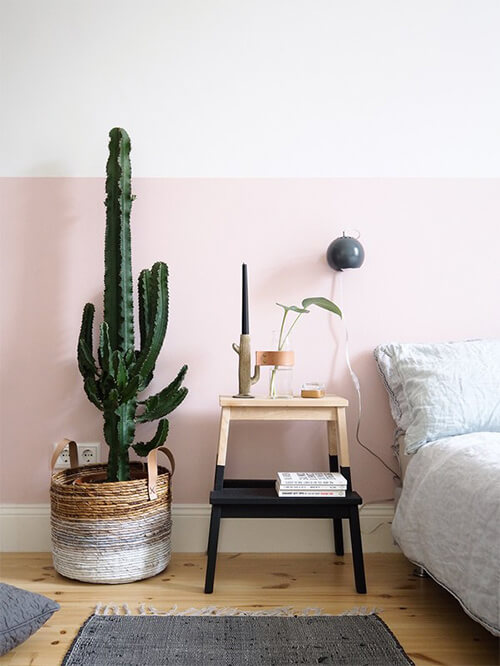
In Nordic decoration, white, wood and natural fibers stand out. What if we add a touch of pastel pink? A bedroom that could have been somewhat bland due to its simplicity takes on a new dimension. In addition, the subtle pastel colors are perfect for introducing them into this type of decoration without breaking the harmony of the whole.
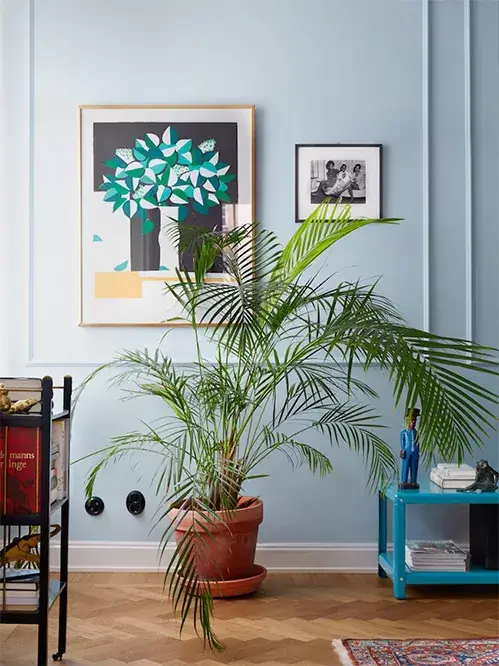
Pastel blue walls with molding
 is
is
Pastel blue (or pastel pink) are colors that have been associated with kid’s rooms and are sometimes even known as baby blue or baby pink. Fortunately, the color trends for the little ones are no longer limited to pink and blue, and pastel blue can work very well in other spaces. This pastel blue wall is enhanced by using moldings that enhance the paintings and add character to the room. Nothing to do with a children’s bedroom!
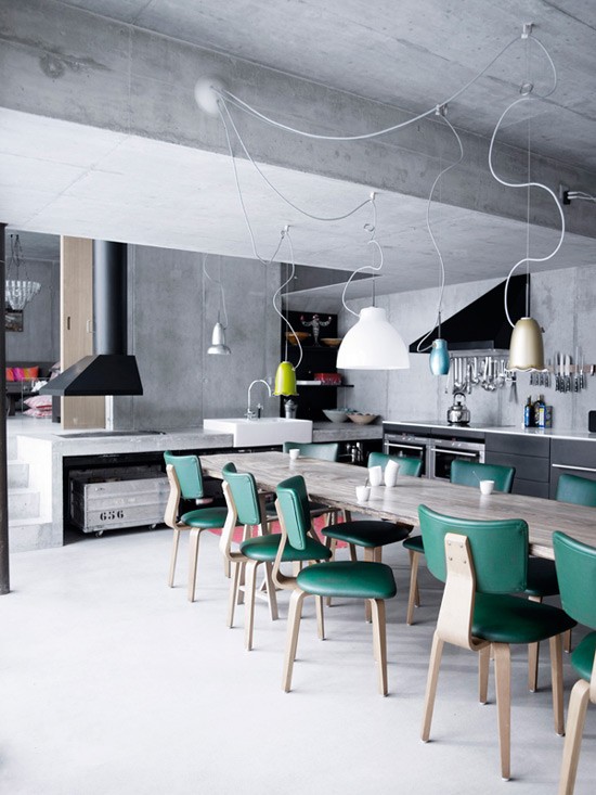
Play with pastel tones on the wall
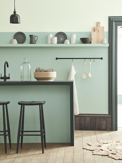
Even if you don’t like pastel colors, some shades are difficult to find fault. In this kitchen, two shades of bluish-green are played on the walls, accompanied by a deeper one on the door frame and the countertop. These subtle contrasts between different shades of the same range are a good way to introduce pastels into your home and bring a lot of light to the whole.
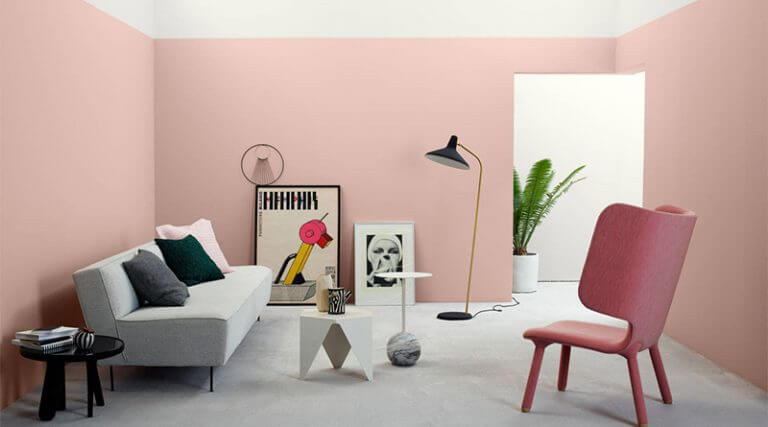
Contrast with walls in pastel colors

We have seen that combining different tones within the same range looks very good. But what happens when we use complementary colors? In this house, they have not been satisfied with comparing pink to green, but also, the two colors have completely different intensities. Pastel pink is the ideal counterpoint to the bluish-green of the wall. A tasteful combination!
Combine pastel tones with dark colors

As you have seen, pastel colors do not usually conflict with others, so you can combine them with other more striking colors and serve to lighten the view when used with very dark colors. Pastel pink combined on a wall with black, graphite or a dark bluish-gray turns the softness of the pastel color 180 degrees for an on-trend space.