Painting is one of the most practical ways to change the look of a living room without investing in new furniture. The main tip of choosing the colors of living room paints is observing the environment and analyzing the tone to perfectly match the table, ceiling, floor, wall position, etc.
The combination of colors gives the room a feeling of coziness, creating a proposal of personal style. A well-made painting with balanced tones can renew your space at a low cost.
1- What is the best color of paint to paint the room?
We cannot forget that each color transmits and creates a different effect on the environment. And, taking into account that the living room is one of the most used rooms by the whole family, you must know how to select the best colors for the living room.
It would help if you also analyzed the style of the furniture and even the details, such as paintings, cushions, a lamp for the living room or even a chandelier, for example, to match the colors of paints for the living room, because in this way it will be possible to make a harmonious decoration.
2- What is the best paint color for the living room?

Color perception is related to ambient light, whether natural or artificial. Sometimes, when you choose room paint colors from catalogs, that same color looks different in the room after painting. This is due to lighting on the color that changes our visual perception.
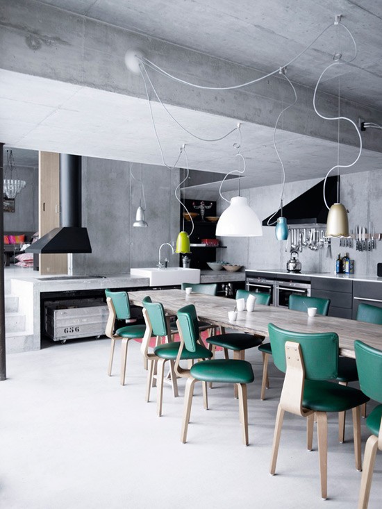
In order not to make mistakes in the colors of living room paints, architects and interior designers usually buy samples of the chosen colors and apply them in the exact place of the painting to observe what the visual effect of the color will be with the lighting of the environment, remembering that the color green is the one that changes the most with illumination.
Before defining the colors for the living room wall, consider the following points:
3– What is the use?
Think about how you will use the room and what is essential. Mainly consider the following factors:
How will the space be used (watching TV, entertaining friends, reading, etc.)?
What time do you usually use the room?
Should the room have an energizing or relaxing effect?
Does the environment receive enough sunlight?
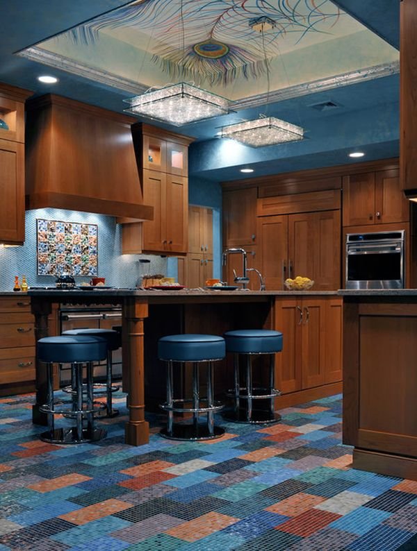
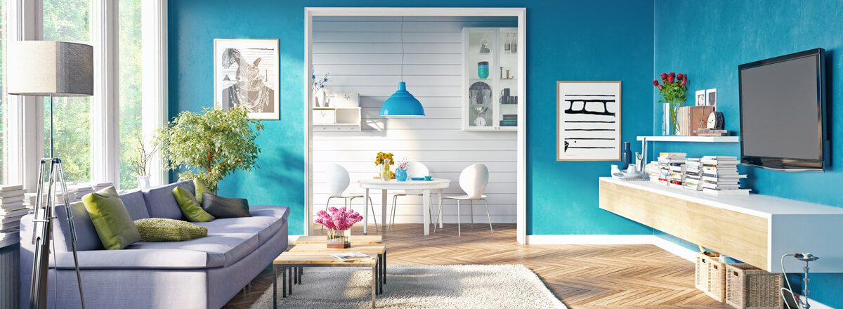
Living room paint colors: total blue
4– Enjoy natural light

There is a perfect living room color combination for sunlit spaces. For a living room that will be used during the day and receives plenty of sunlight, set the walls with saturated jewel tones or earth tones.
Bright shades like sapphire blue or emerald green look great in the sun.
Likewise, dark, earthy colors look best in spaces with lots of natural light, as the lighting keeps the room from looking too dark.
Note that such colors overwhelm low-light environments and should not be used in these cases.
5– Light up a dark room with bright colors

On the other hand, if the room doesn’t get a good amount of sunlight, or if you plan to spend more time in it at night, there are specific colors that will help brighten the room.
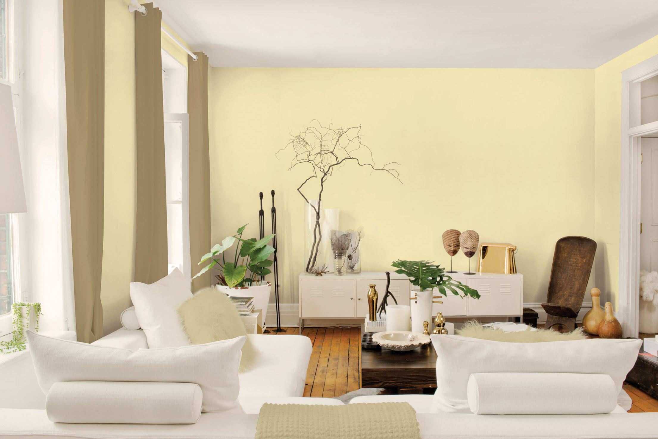
Ivory and lily yellow can make a room that doesn’t get a lot of light look brighter, mainly when these colors are used as an accent.
The dimly lit space can also be brighter in green and light blue tones.
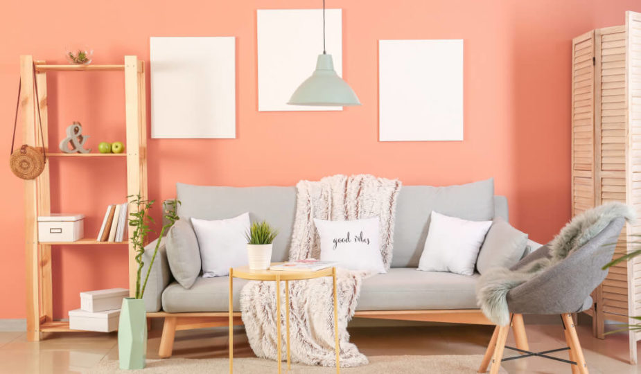
6– Create a cozy atmosphere with warm tones

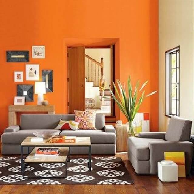
Another aspect to consider is the temperature of the room. Red, burnt orange, and almost any shade of gold and brown can be used to create a cheerful and cozy atmosphere that is compatible with that of a living room.
These combinations are great for a room used both during the day and at night, as they combine comfort and energy while still being light enough for the day.
However, avoid using bright shades of red or orange as the dominant or secondary colors, as they are too intense and can overwhelm the room.
Earth tones like dark yellows, browns, and rusty reds can warm up a space and work well with all types of lighting.
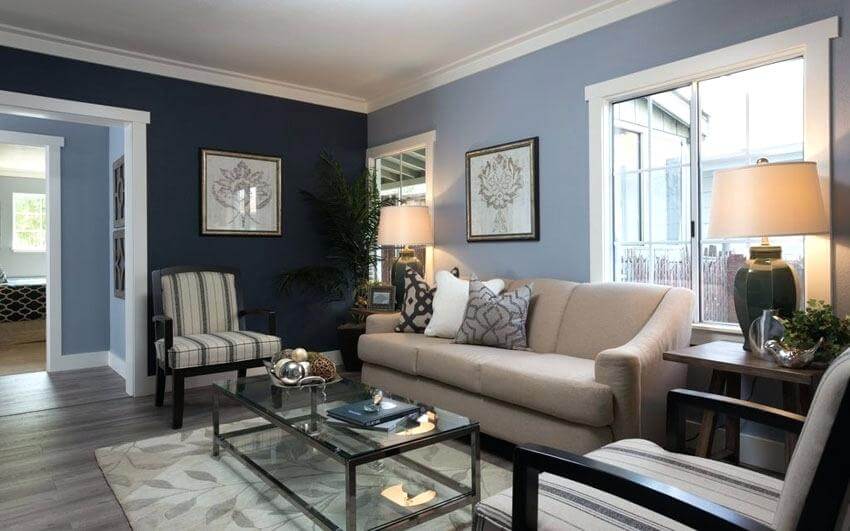
7– Feel relaxed with cool colors

On the other hand, blues, light purples, and grays are perfect for creating an atmosphere of calm for you, your family, and your guests.
Cool colors are great for a room used more at night, especially in a space designed for relaxation. Green is also an excellent choice to create a serene environment.
8– Opt for light colors in a small living room

Light colors tend to open up space and make a room appear larger. Those who have a small room should choose bright colors in cream, beige or white tones, just as they should opt for paintings for a small space. You can paint the walls light and add highlights in more intense colors.
9– Use darker colors in a large room

Dark colors make the space feel more enclosed, so they shouldn’t be used in small rooms. However, those with ample open space can choose an intense color, such as navy blue or plum, and be carefree.
Overall, you should avoid painting the entire room a dark color. Instead, paint the accent wall.
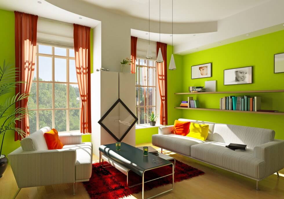
10– Use intense colors only as a highlight
A flashy color can bring a lot of energy and personality to the space. Make that impact with an accent color. To express more vitality, it should be the brightest color scheme.
Choose colors that match each other. Test a small area before painting and redecorating the entire room.
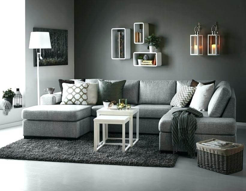
The good idea is to use a neutral color like beige or gray as a base, as they are versatile and classic.
11– Match the color scheme to the furniture


If you have modern furniture and decor, you should choose a matching color scheme, such as a combination of white, black and gray.
On the other hand, those with antique or classic furniture can use bright, modern colors to renew the space.
Consider the furniture’s current color scheme by painting the walls a secondary color and accent that matches.
12– Use white for a simpler and cleaner option

While many people preferred a more attractive dominant color, there’s no denying that white color schemes, offer a nice clean, well-maintained feel. Bet on white, and you won’t go wrong.
There is a wide variety of “white,” such as ice, cream, eggshell, nude, gray, off-white, etc.
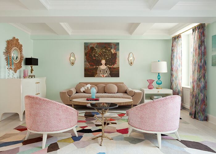
13– Use subtle tones for a contemporary color theme


Contemporary colors include subtle shades of natural colors that can help create an atmosphere of calm, but still, give the space a little personality.
Light browns or grays work well as dominant colors, and slightly darker shades of the same colors can take the place of secondary and accent.
14– Opt for neutral colors to modernize the living room

Most people decide to renovate a room to make it more modern. And some color combinations help make the environment more contemporary. If that’s the case, stick with neutral colors in general.
White is often the dominant color in modern living rooms. And a black or gray are great for secondary colors. As a highlight, choose something intense and bright, like green, blue, or red.
15– Combine bold and neutral colors for the traditional color scheme

More classic designs use dark shades of elegant colors to add sophistication to the living room. Use neutral colors for most walls and other dominant areas of the space, but stick to rich shades of red, blue, or brown when choosing secondary colors and accents.
To make the room look even more sophisticated and traditional, use a “historical” color like colonial yellow, dark olive green, pearl gray, or Prussian blue.