You will already know that Pantone has chosen not one but two for 2021: Ultimate Gray and Illuminating, that is, serene gray and bright yellow. Do you want to use them?

Instead of just one, this time, the institute has chosen two Pantone colors for 2021: Ultimate Gray, light gray, and Yellow I’ll ruminating, bright yellow. Experts at the Pantone Color Institute have chosen them amid a pandemic because “they are a couple that transmits a message of strength and hope that is both lasting and uplifting.” Discover how to integrate them into your home decor.
Serene and balanced, joyous, and cheerful. Gray and yellow have been crowned as the colors of the year, a perfect combination to decorate your home. Dare yourself!
A DUO TO SUCCEED

Dress up your walls with Dragonfly Garden Steel Gray Wallpaper, with an elegant flower and stem design
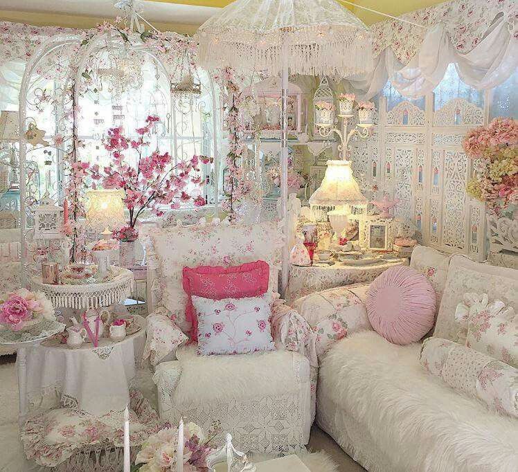
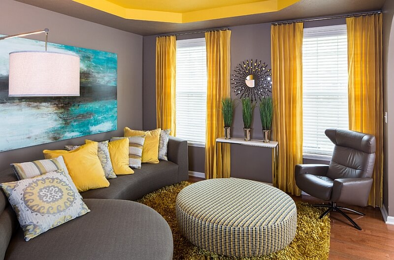
ELEGANT LIVING ROOM

Start by including yellows and grays in cushions and curtains. If you like the effect, move on to upholstery and furniture.
Curtain made with Coulisse fabric, from Camengo, in polyester.
APPLY FENG SHUI AT HOME
Did you know that each color has a property and capable of increasing harmony and positive energy? According to Astrid Izquierdo, from Sincronia Integral, “it is convenient to use gray in small doses and only in bright spaces to avoid an excess of cold and dark yin energy. That is why yellow is the perfect complement because it connects us with the sun’s energy, light and joy. A touch of this color will generate a more optimistic state of mind”.
USE COLORS TO DELIMIT AREAS

The good idea is to use wallpaper in either of the two colors of the year and thus visually differentiate environments that share the same space. “It is also a perfect resource to highlight a front: the headboard wall, the sofa wall …” says Raquel Simón. And for those who still do not dare to use yellow in large doses, Constanza Subijana recommends tinting it with white.
DARE TO PAINT YELLOW
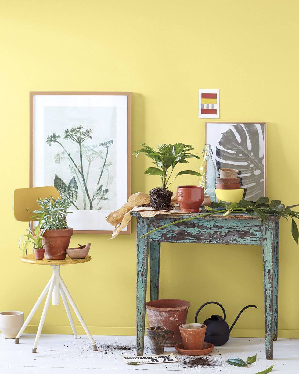
It is the color of joy: we associate it with spring, sunny days, and warm places. His presence encourages and fills the rooms with optimism. Whichever shade is chosen, it has the power to enhance natural light. Hence, it is perfect for dark and cold rooms and those that only get the sun at sunset. Combined with white and wood, it will transform a sad corner of the house into a stimulating environment, which will always seem sunny.
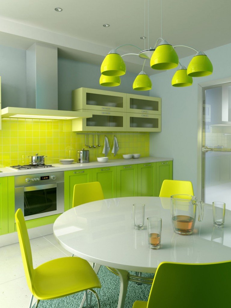
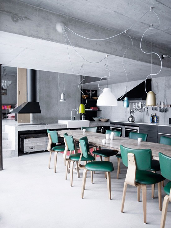
IN THE KITCHEN: YELLOW AND GRAY

The warm colors, but in intense and vibrant tones, whet the appetite. Bright and cheerful yellow is an excellent hue for this room in the house. Why not apply it to furniture and walls? I don’t think it’s just for bold and modern decorations. It also fits with more classic and serene styles, as in the image that accompanies these lines.
YOUTH SPACES

A couple of the years can also help us highlight architectural elements such as a pillar, a column, the frames of doors and windows, or visible pipes. This was done in this youth space, where yellow subtracts seriousness from gray and brings very fresh air.
ADD CHROMATIC COUNTERPOINTS

See a simple way to make an antique piece of furniture fit in with its new, more current environment. In the case of this French desk, bought at Olofane, it was decided to paint the interior in an intense and bright yellow tone and keep its exterior in the wood’s natural finish. Each time it is opened, its classic style rejuvenates, the piece gains character and brings a surprising and fun burst to the decoration.
USE A BREAKER ELEMENT
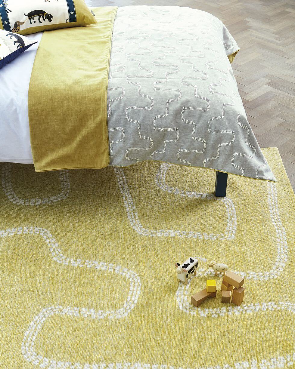
In environments where neutral tones predominate, covering the floor with a yellow carpet is an excellent option to break the monotony and add visual richness. And not only that: “it will be a focal point of attention and, by subtly standing out from the rest of the decoration, it will add a fun touch to space, without saturating it,” explains Raquel Simón, founder and director of the Madrid School of Decor.
GAIN VISUAL DEPTH WITH GRAY

The effect achieved by painting the walls in dark tones explains Constanza Subijana, Esmadeco professor and winner of three categories of the Home Staging Awards awarded by the IAHSP Europe. Especially if we reserve this color for the back wall of the room, remember that the contrast with the white ceiling will accentuate the room’s height. All are advantages! Once the gray background is defined, add yellow strokes to revive the decoration.
CREATE A NEUTRAL BACKGROUND
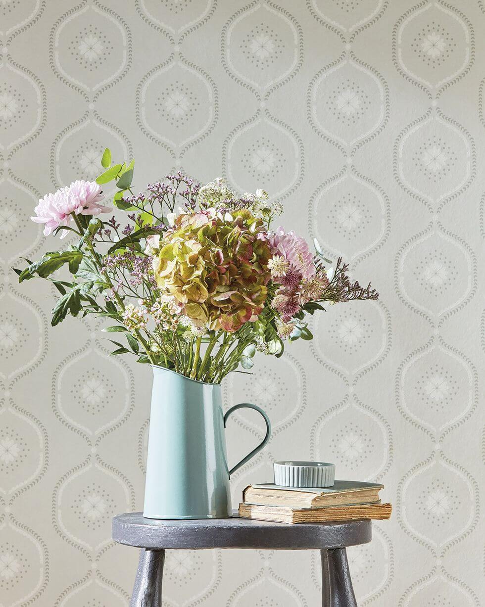
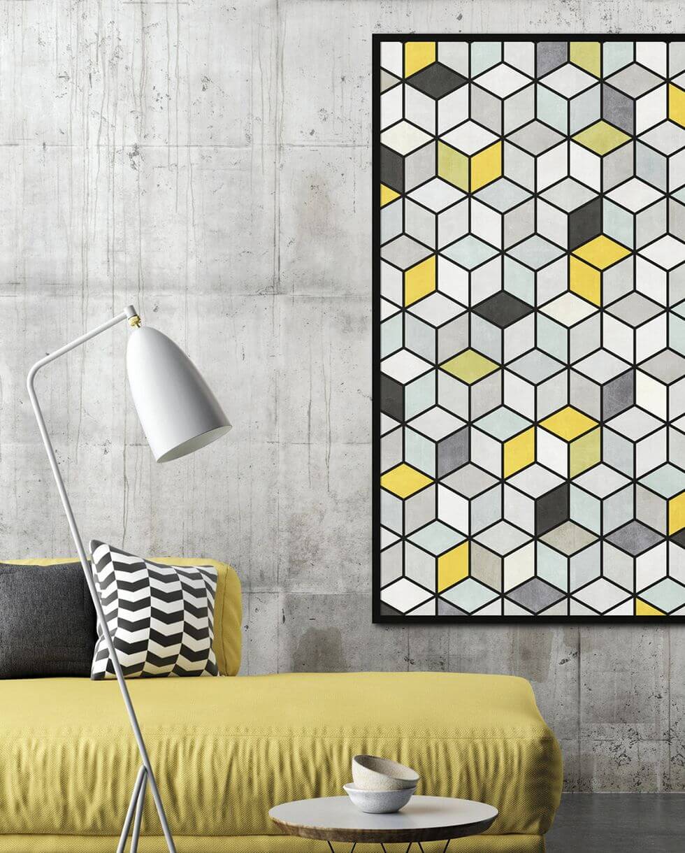
Gray, in all its shades and tonalities, sweeps interior decoration. Constanza Subijana is an elegant and sophisticated palette that makes the walls a perfect canvas to highlight elements in brighter colors that provide luminosity. And easy to combine: it looks good with blacks and whites, but also with yellows (your partner this year), pinks, greens, blues.
DO YOU PREFER IN SMALL DOSES?
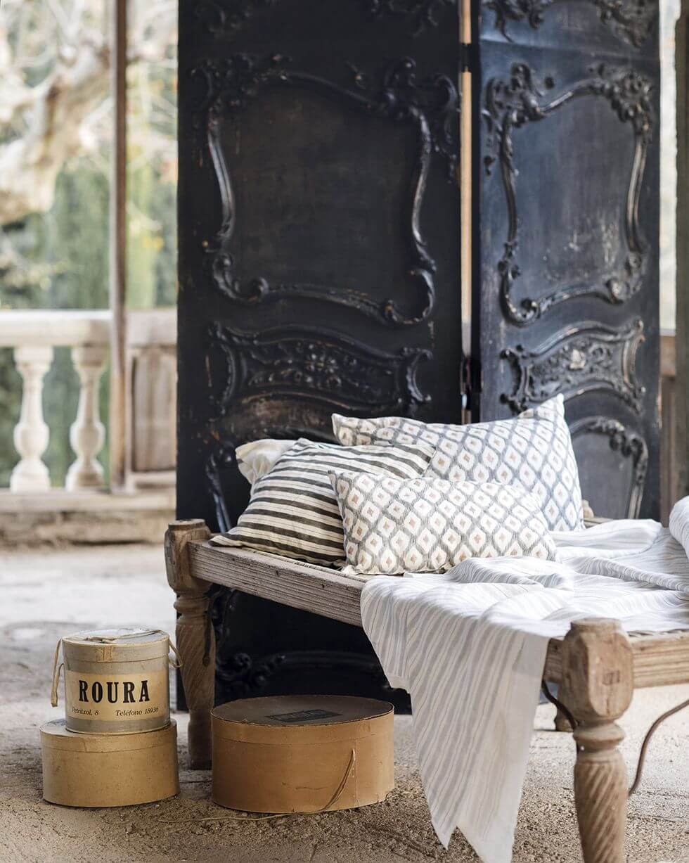
Whether on walls, furniture, or details, gray gives sobriety and elegance to environments, even if used only in brush strokes through textile accessories. Raquel Simón reminds us that this color can be used without fear of abusing it in any of its shades. “If we combine it with woods and white or black tones, a soft and attractive contrast will be created,” says the Esmadeco director.