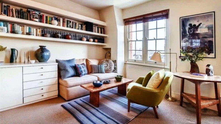
When choosing colors for rooms , several aspects must be taken into account, for example, furniture and textures already present, in order to combine in the best way. Your living room is probably the busiest room in the house, so decorate it to be a place where you really want to spend time.
We show you some colors and combinations that will be used in 2022 to inspire you. Many styles have been a trend in recent years, when it comes to interior decoration, but many times we forget that we simply want a simple, cozy decoration that makes one feel really at home. That is why we advise you not to complicate yourself too much.
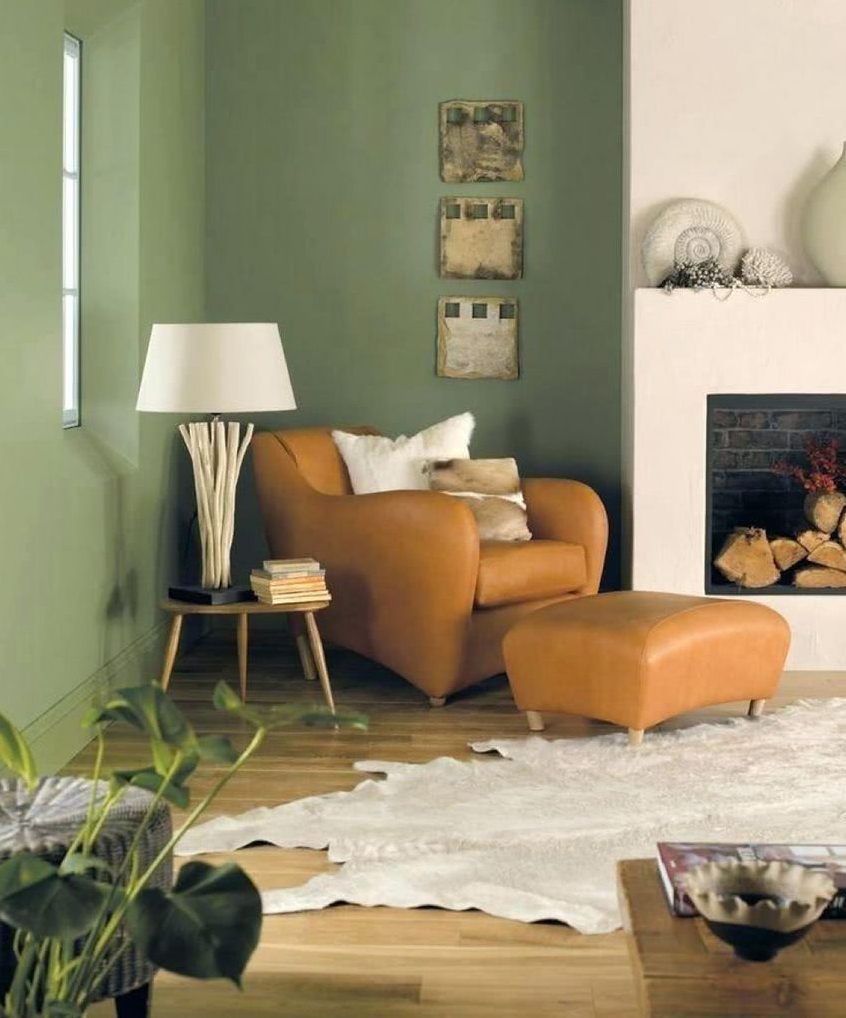
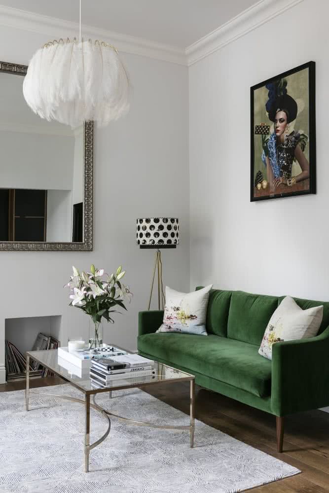
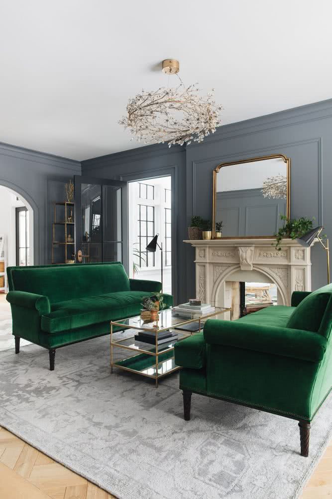
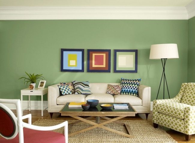
Shades of green
There are already several paint companies that have made their predictions regarding the colors that will be used in the home. And without a doubt, the color green has been one of the favorites for several seasons, and will continue to be. These are the shades of green that will be used in 2022.
1- Sage green
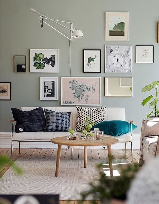
This shade is being used a lot. It’s a muted pastel green mixed with gray, very neutral. The environments feel very calm with this beautiful color.
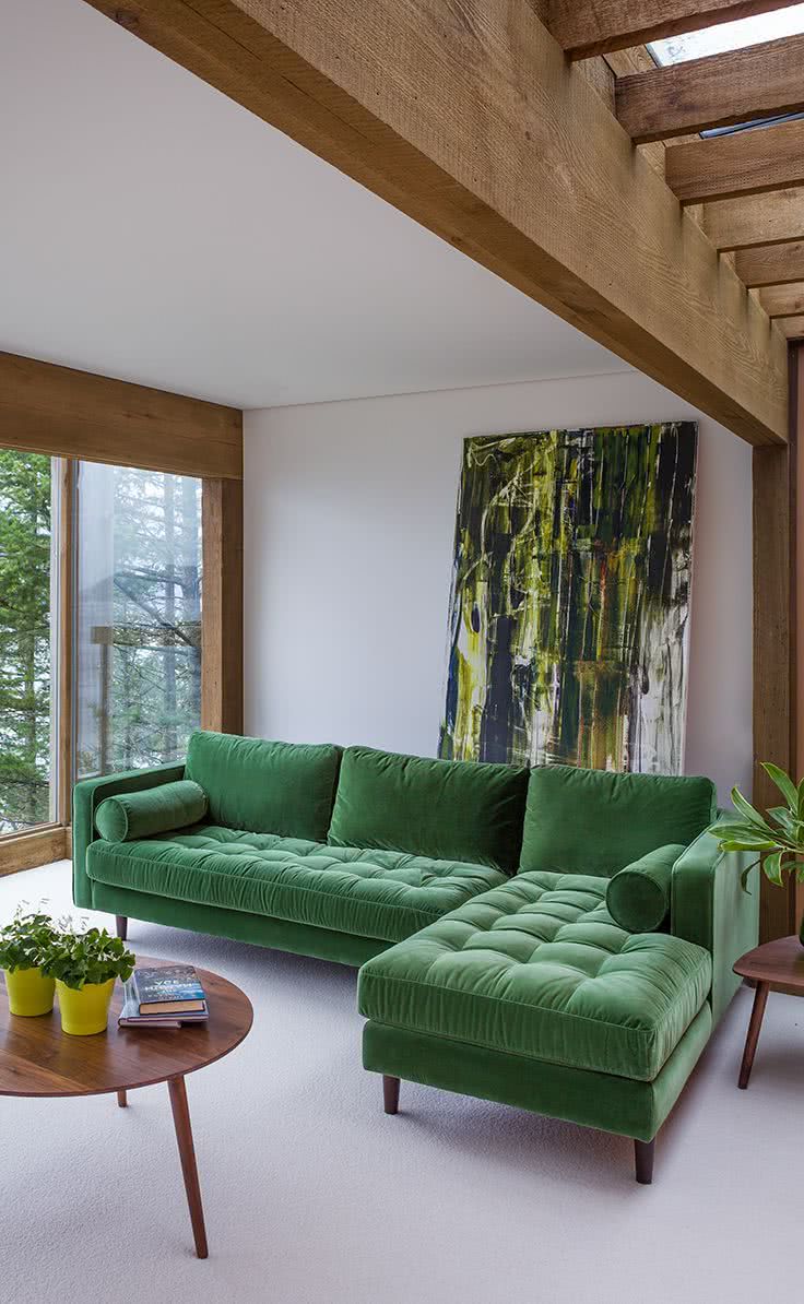
You can also use a more saturated shade of green, not so pastel. Applied on a single wall it looks great.
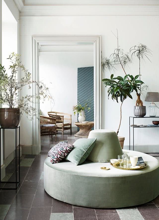
2- Foliage green
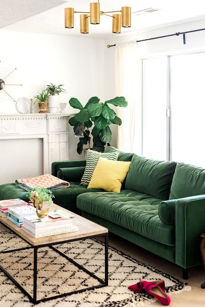
The color of the vegetation is also being used a lot in interior decoration. Provides a lot of freshness and positivity.
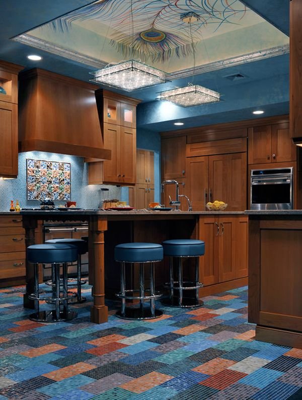
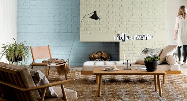
3- Bluish green
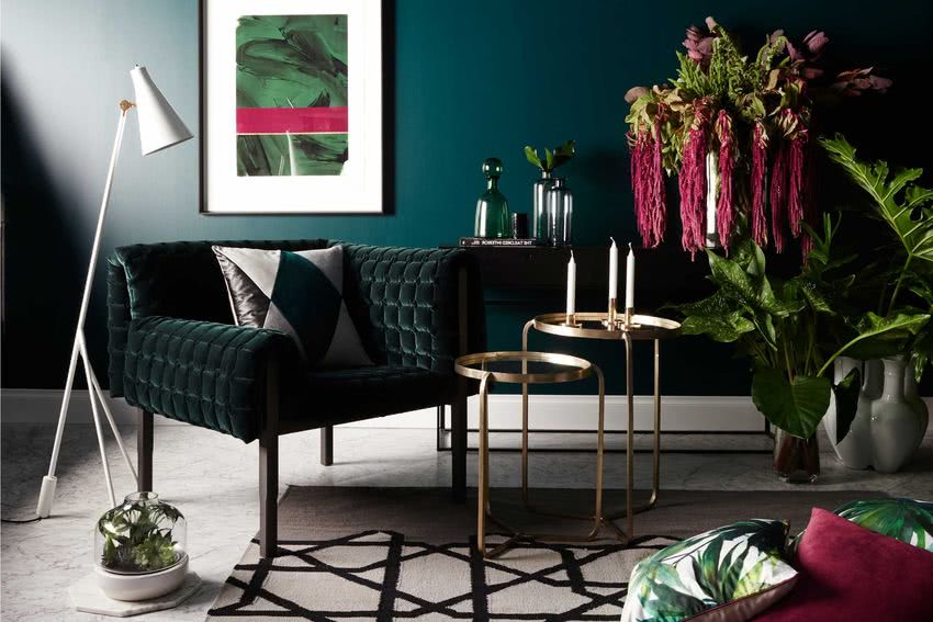
Another beautiful shade of green, which mixed with blue, creates a beautiful and elegant composition in the environments.
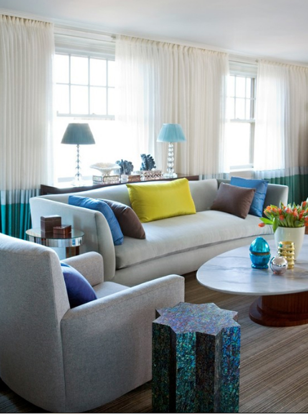
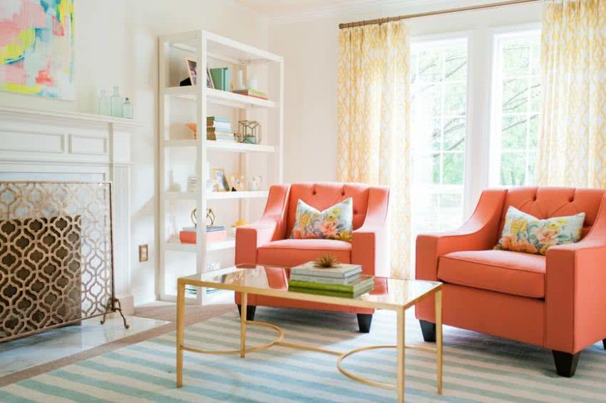
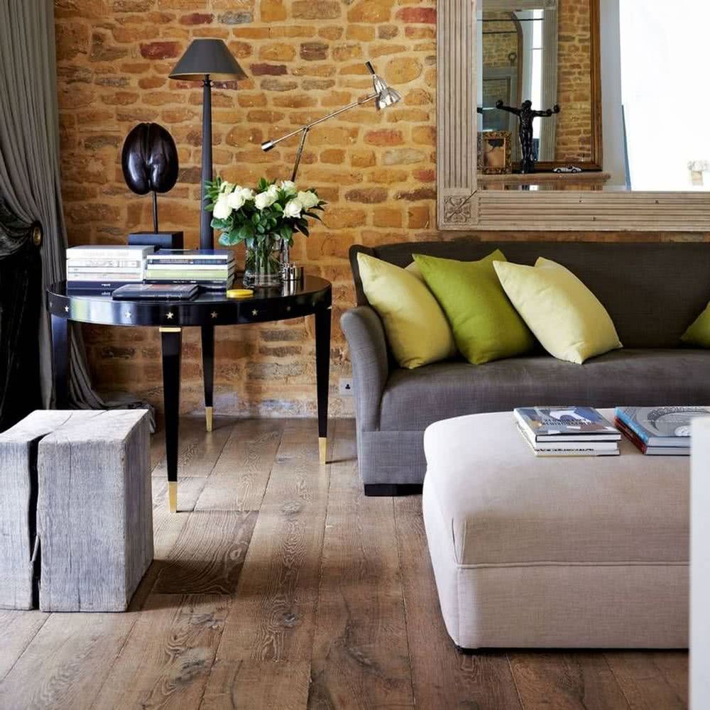
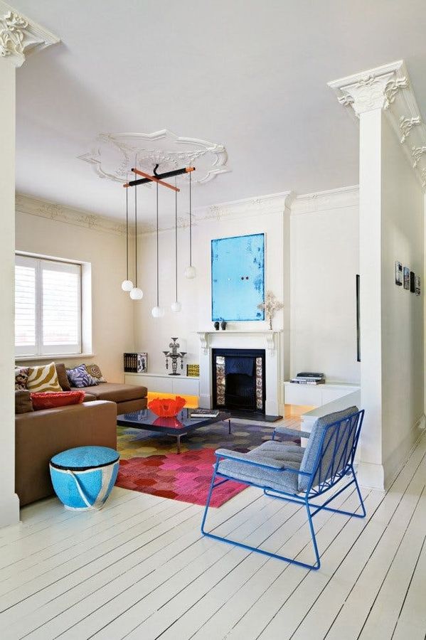
4- Vivid pastel shades
You can add a “playful” palette to your living room, with colors like Minion Yellow, Lime Green, or Blue. What better way to show off these great colors than on a cushion with an abstract pattern, made by yourself?
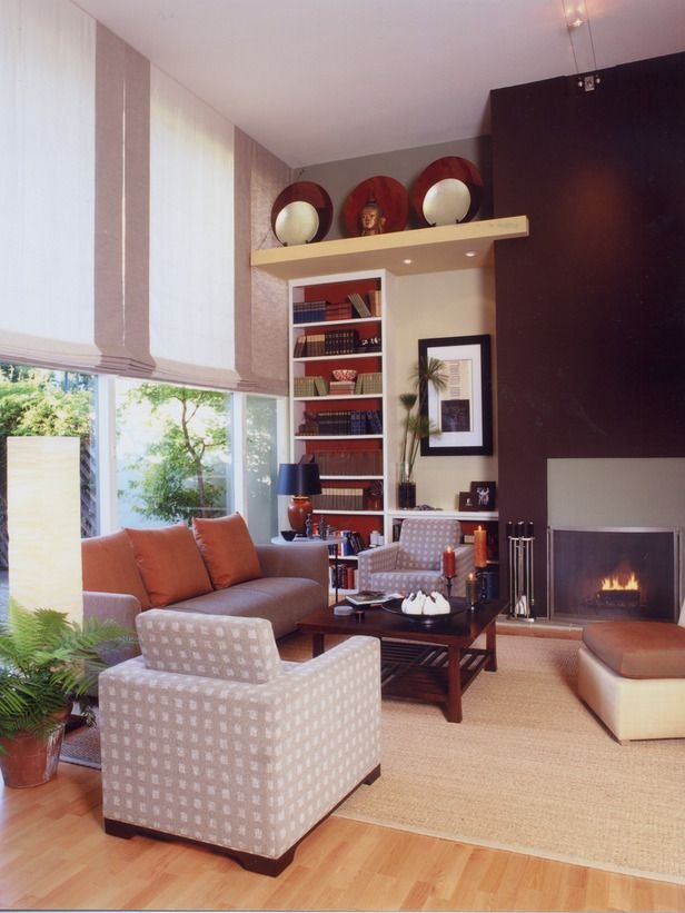
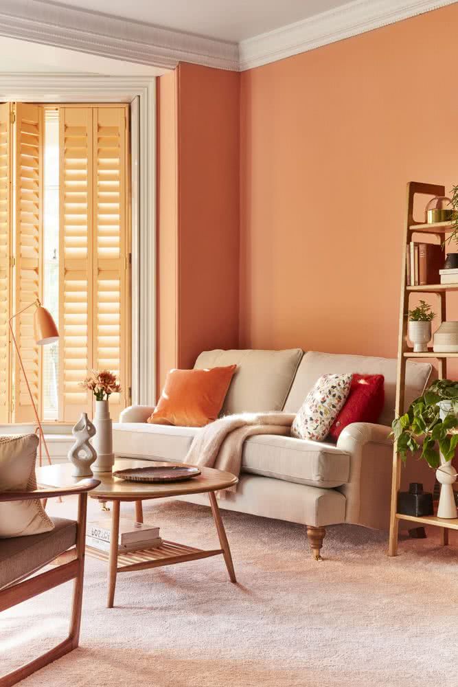
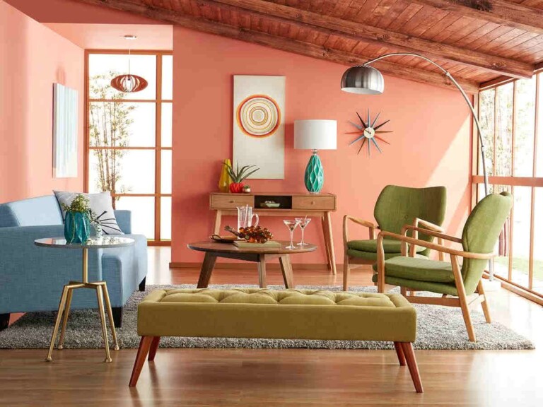
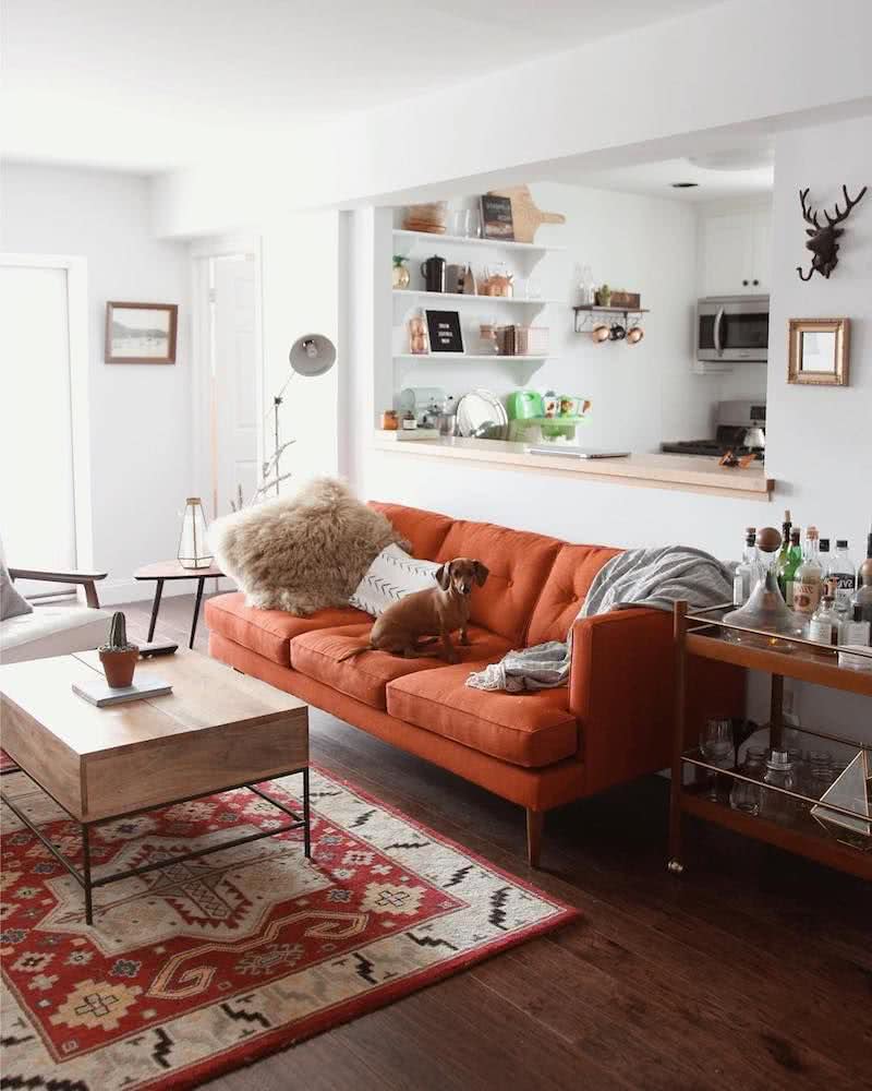
5- Orange
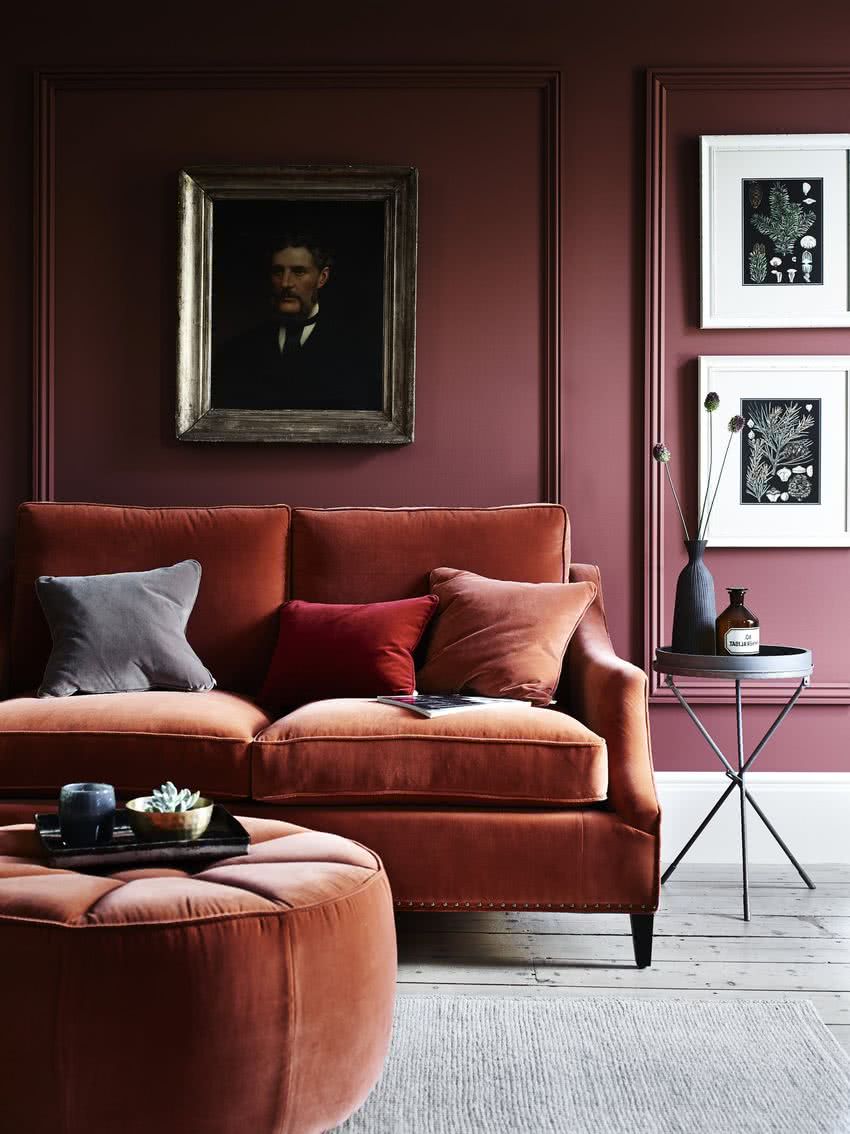
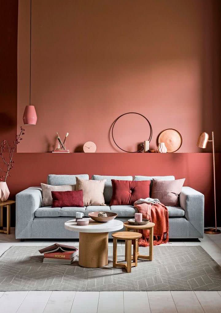
The rust orange and pumpkin color are another option to decorate this year. Combined with pink, brown, wine and earth tones, they can be a great backdrop for a living room.
Orange and blue. These shades can give the room a subtle and tasteful color that will welcome guests from the moment they enter the room.
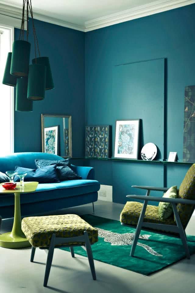
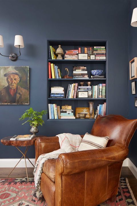
6- Blue
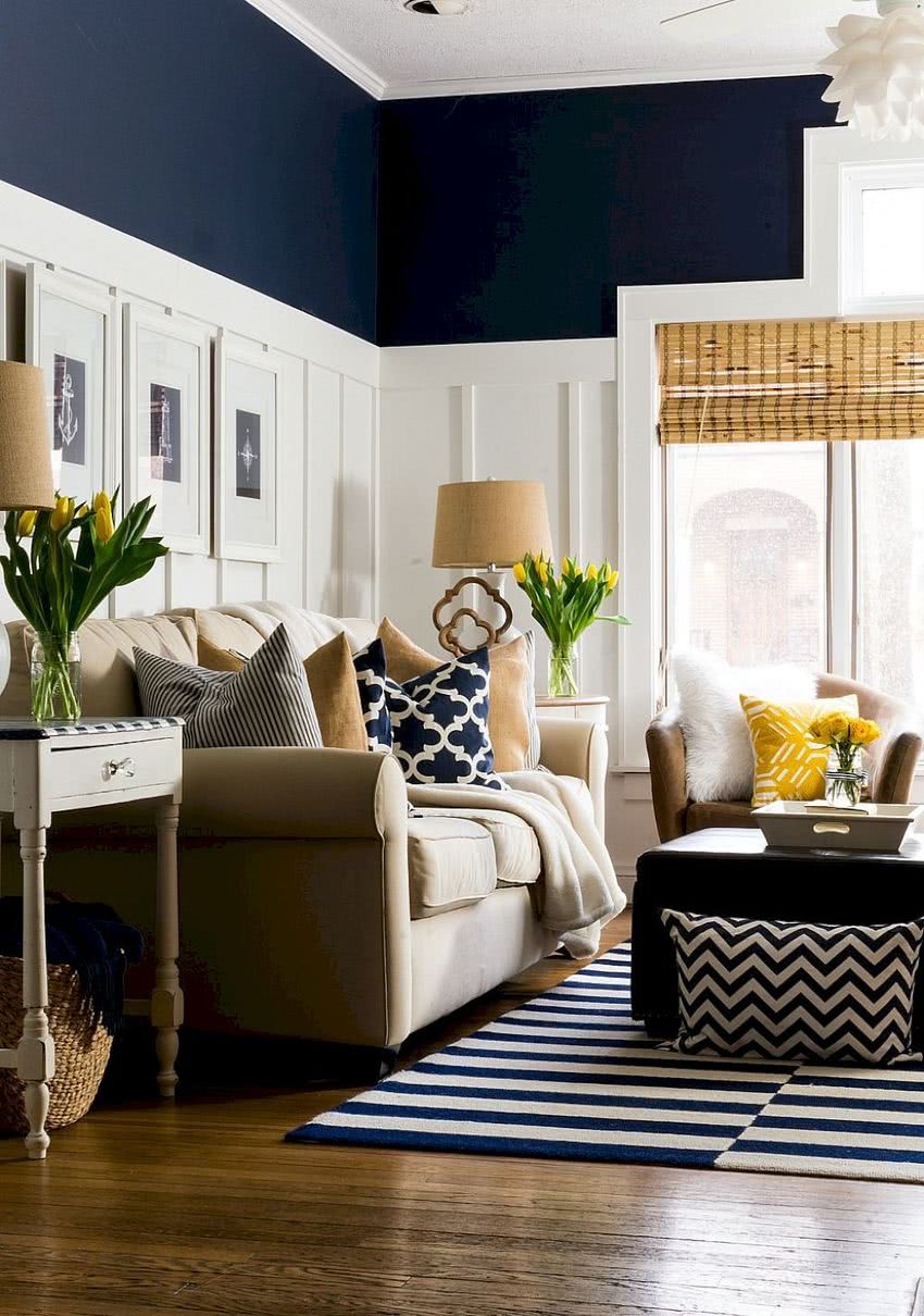
Navy blue and lighter pastel tones also make a great return.
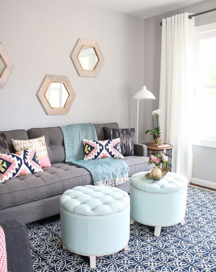
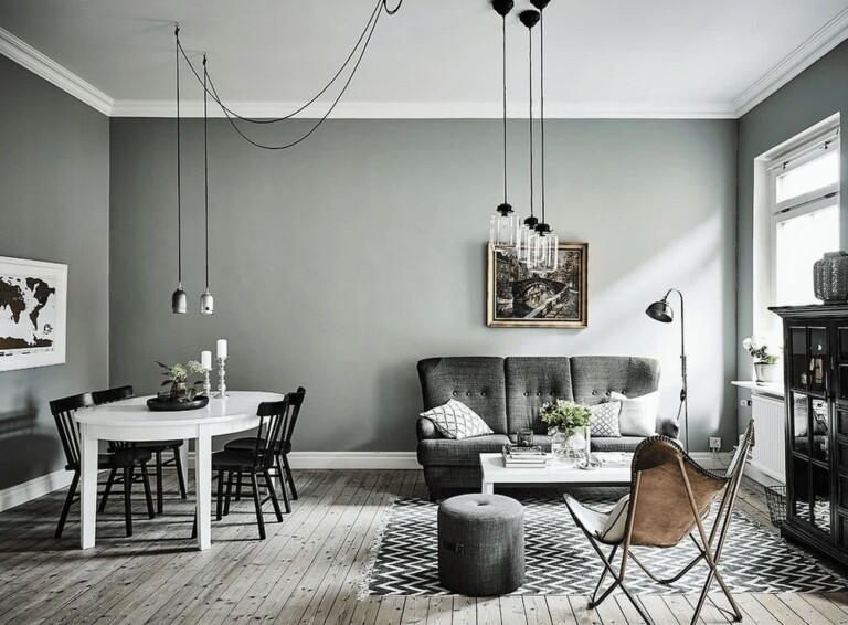
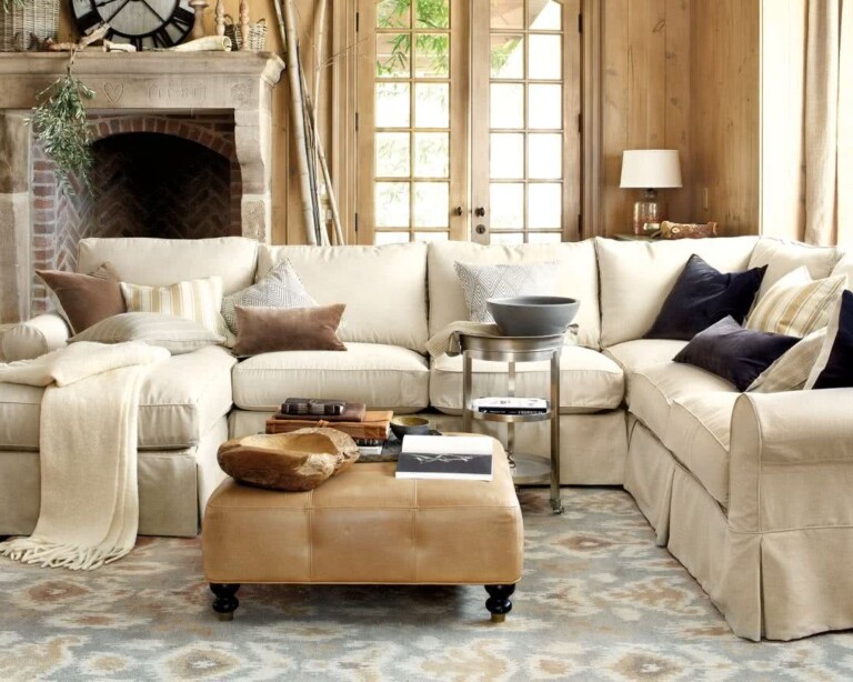
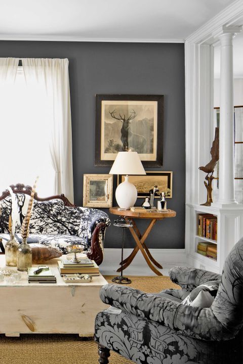
Grays
Neutral colors, such as grays, beiges, creams, are one of the main trends this year. When we talk about neutral colors, we mean harmonious decorative colors, which allow the possibility of combining with any other color.
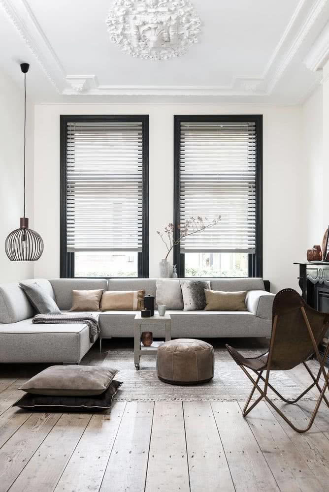
7- Gray and white or beige
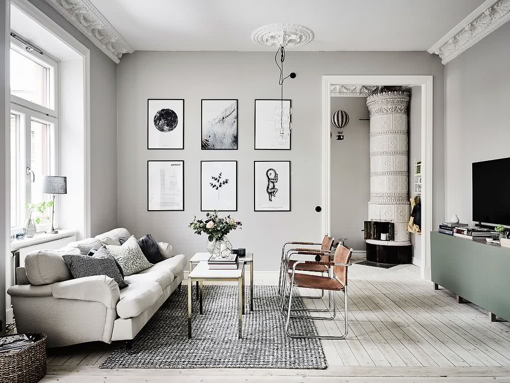
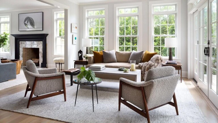
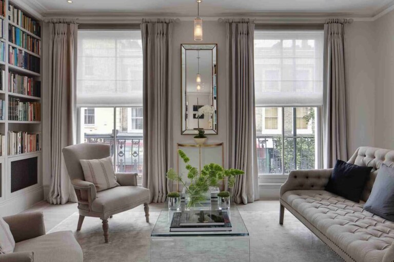
Grays can be used in all shades, from very pale pastel shades to dark slate grays. The gray combined with beige looks very pretty too.
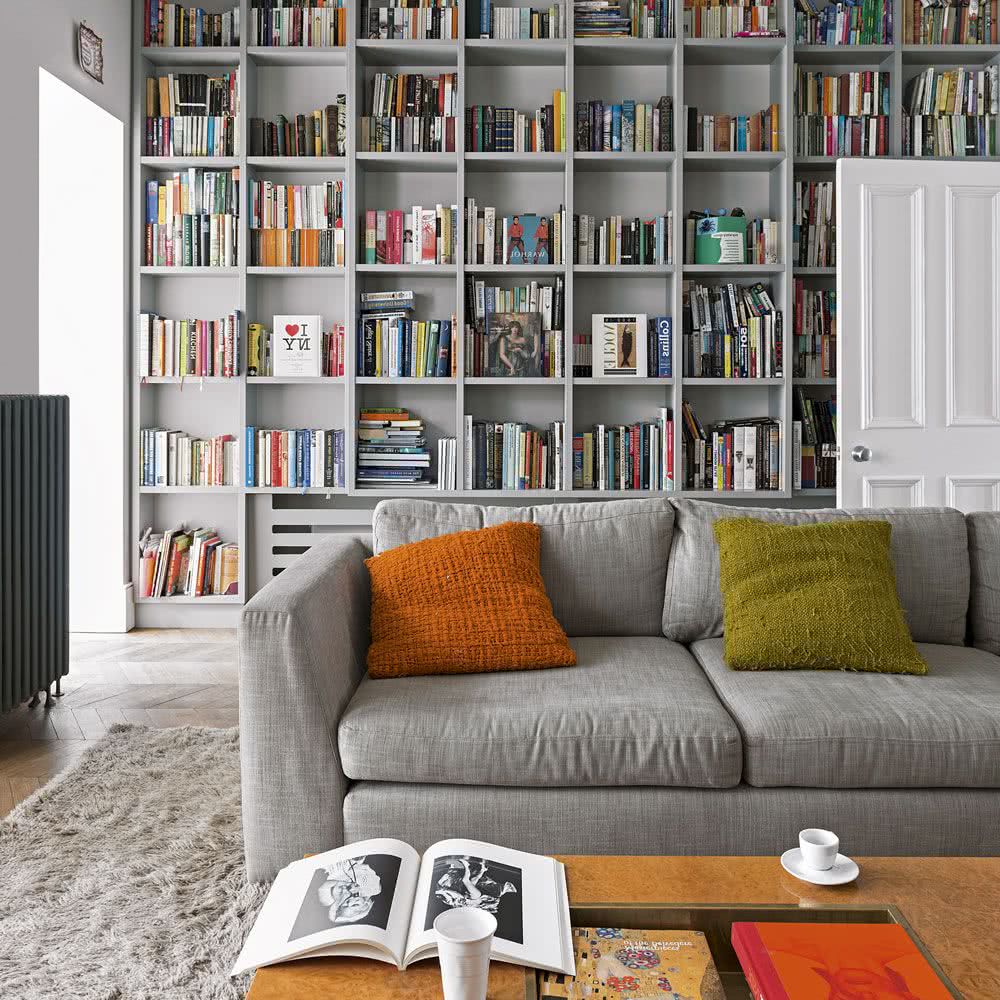
8- Gray and orange
The living room is undoubtedly the most used space in the home, since a good part of the activity of the house takes place there, be it meetings, watching television or just hanging out.
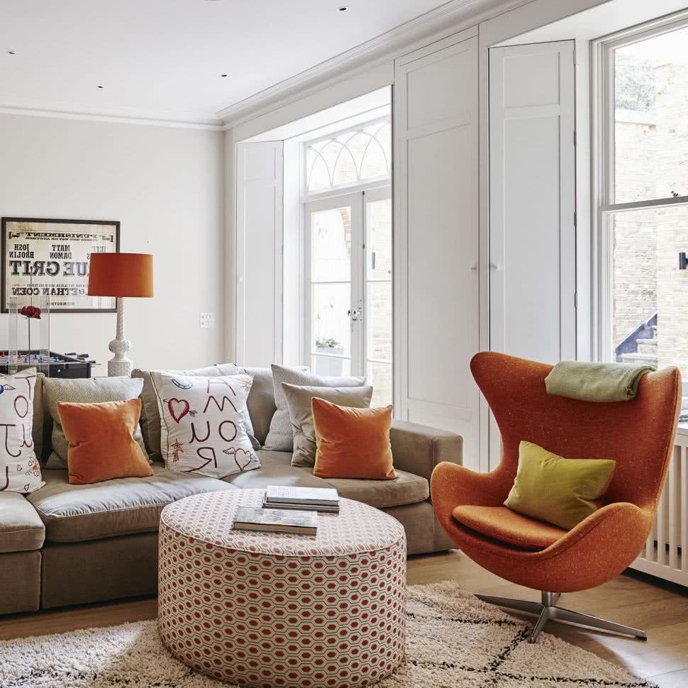
For that reason, it is good to achieve a cozy and attractive space, which can be achieved by using gray as the predominant color, adding some details in bright colors, for example, orange or red.
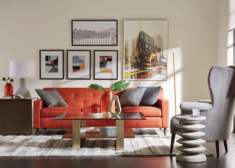
A rustic combination of light and worn woods, with soft and opaque grays, as well as an almost imperceptible nude tone. To remove the monotony, you can add cushions or blankets in magenta or salmon, which add a little energy.
9- Gray and red
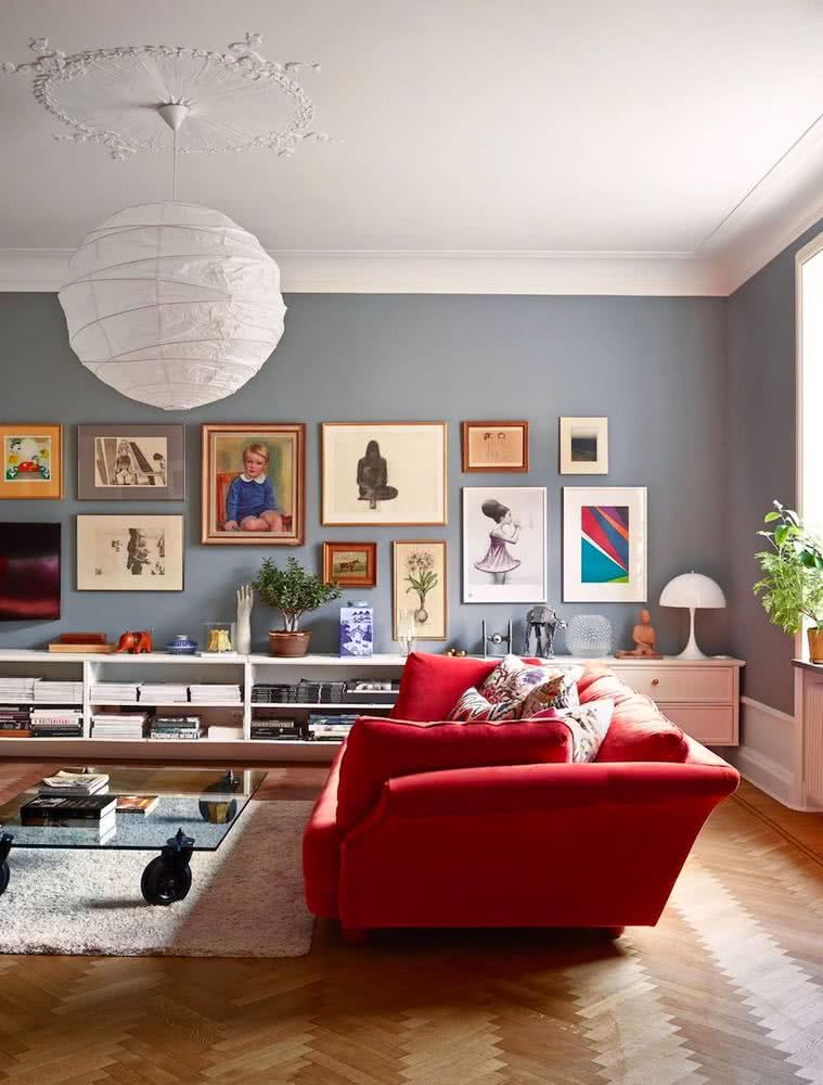
This combination of colors gives a lot of warmth to the rooms.
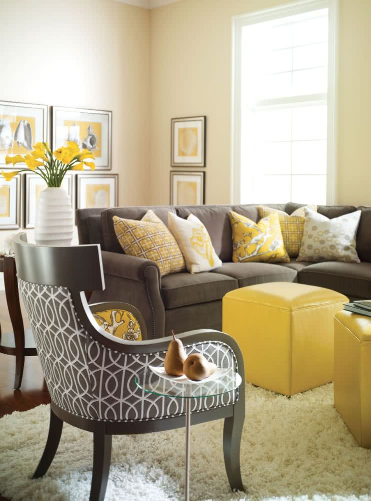
10- Gray and yellow
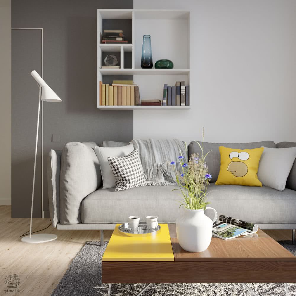
The grays with the yellows also go very well.
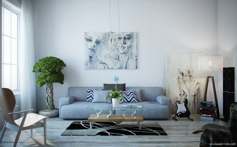
11- Gray and green
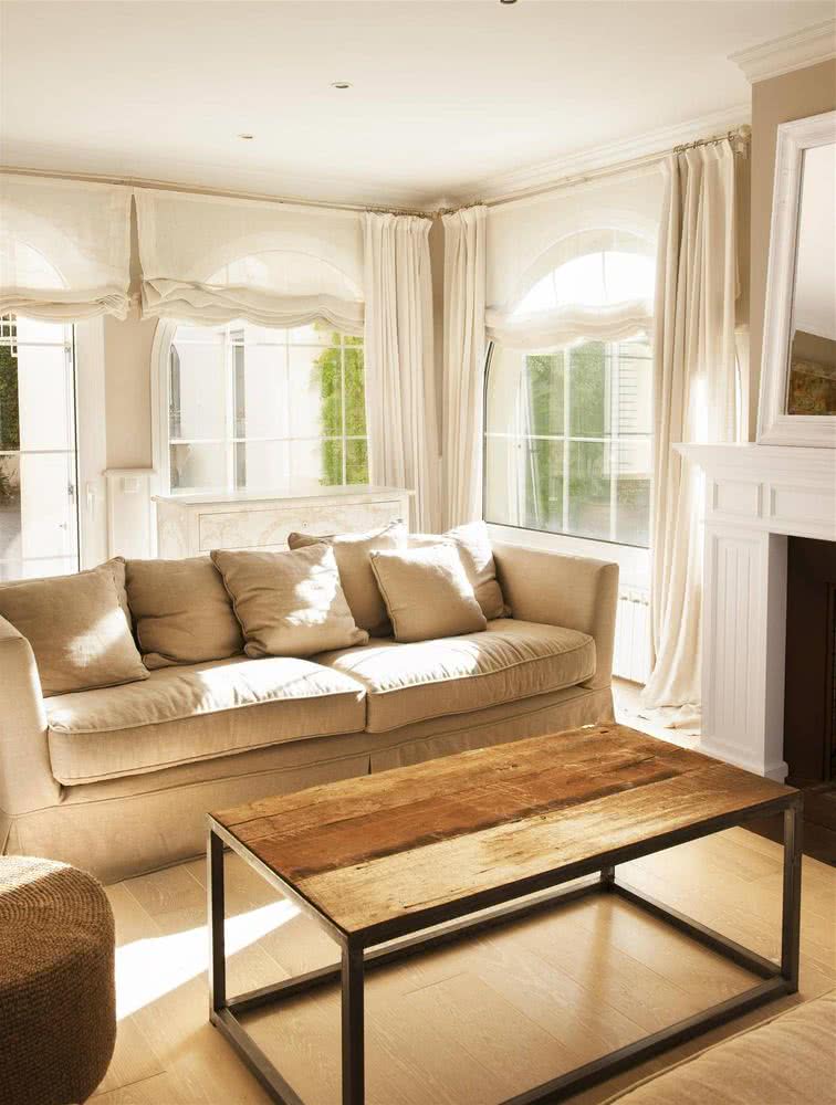
12- Beige
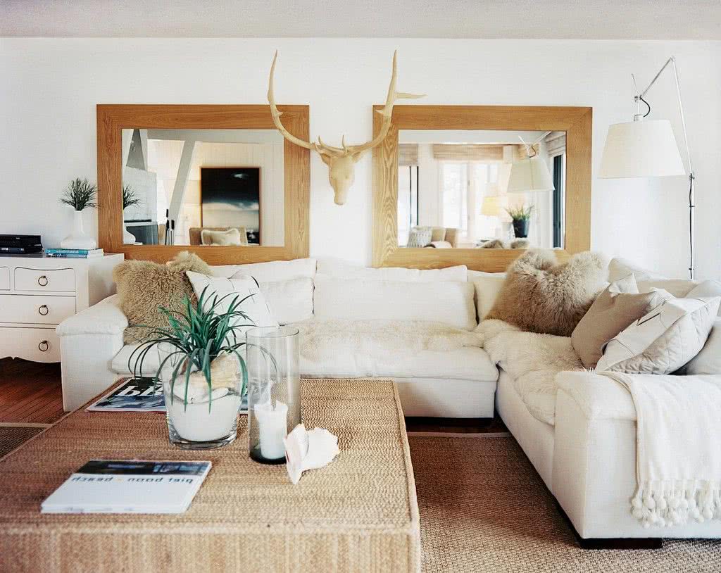
White, browns, beiges, greens and pastel blues always look good in any setting. They are neutral base colors, easy to combine, not very flashy that quickly adapt to classic furniture materials, such as wood or metal. This is another example of how the living room is a whole and it is not a matter of choosing without criteria. The dark cream or ecru color is neutral, but in this case, contrasting it with various brightly colored works of paint, it makes for an invigorating room.
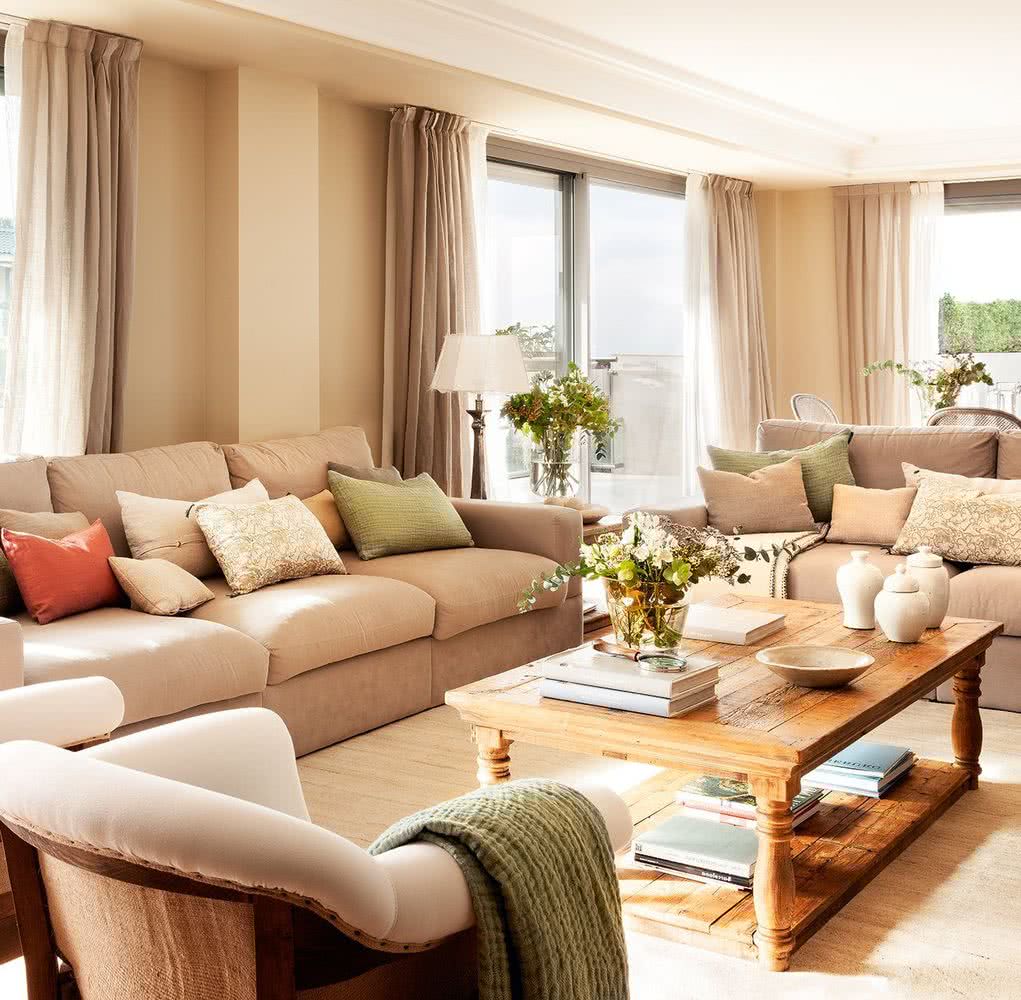
If we talk about materials, wood, velvet, leather or the fabric of your liking, they can stand out against a neutral background, for example, blank walls. Look at this spectacular room, it looks like something out of a dream. Who would have thought that a dark sand color, or earthy brown would be so elegant? The combination with the white of the ceiling provides the elegance, and the sofa, curtains and carpet, the exact combination.
This photo shows a typical luxury living room from the 1930s-1940s, a style that is being seen again today.
Tables and cabinets in dark wood are very elegant and shine in the space, the furniture in black is also very interesting.
The luminaires, for their part, tend to follow trends in dark wood and light shades, although there are also options in iron or aluminum with white shades.
Navy tones always give a calm look, and they look perfect on a neutral background.
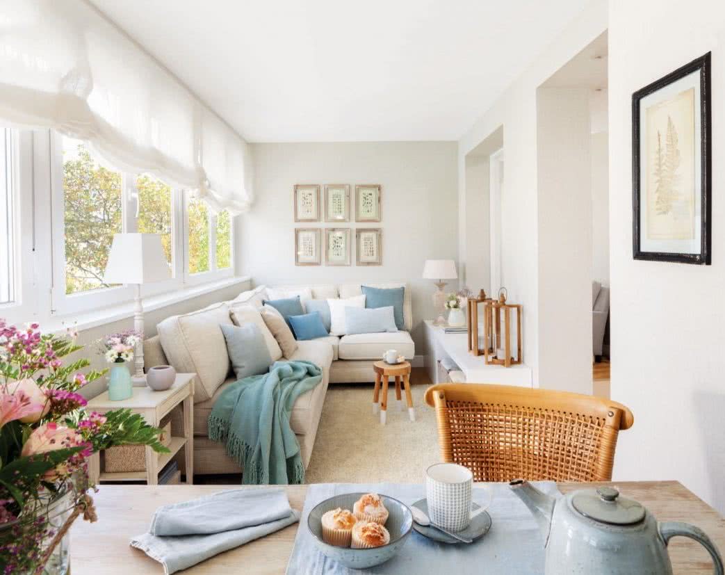
One of the best options is to combine dark brown and white, with pastel colors such as light blue or pale yellow. This combination of colors, manages to give warmth, but at the same time does not darken the room, maintaining its vitality and color.
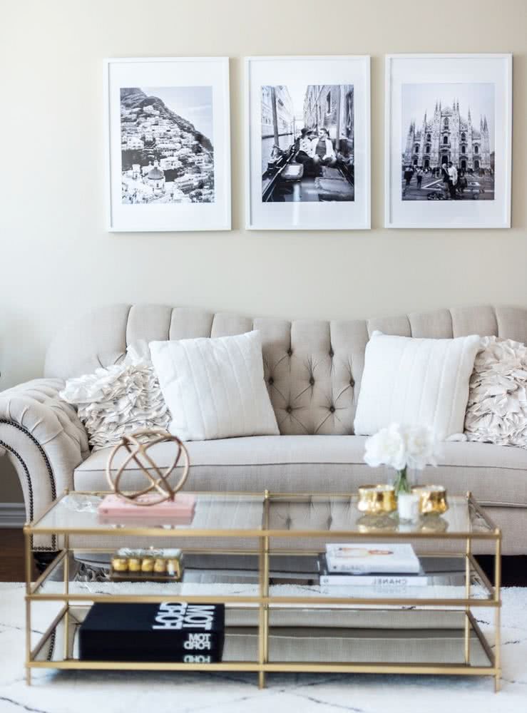
Color combinations for rooms
We will focus on some decorative color combinations for the room that work very well.
13- Neutrals and oranges
If white, raw tones and very soft nude predominate in the room, you can give subtle flashes of color through flowery, polka-dot or striped patterns, with ranges that go from red to orange.
These color interventions would be convenient to do on cushions, lampshades and centerpieces.
14- Pinks and fuchsia
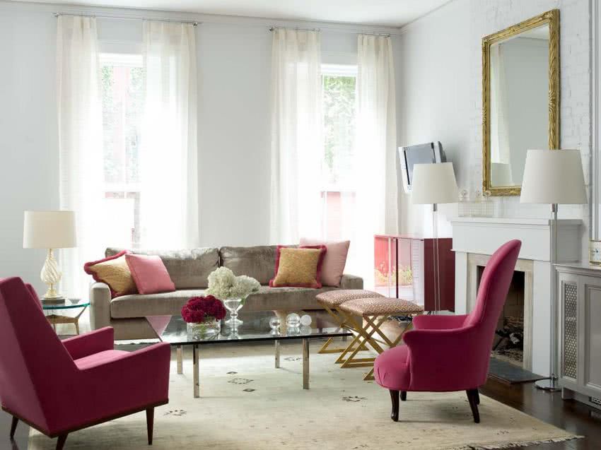
A harmonious combination of soft roses, accompanied by lots of natural flower, glass and metal coffee tables and classy furniture, with raised patterns, looks fabulous.
15- Reds and beige
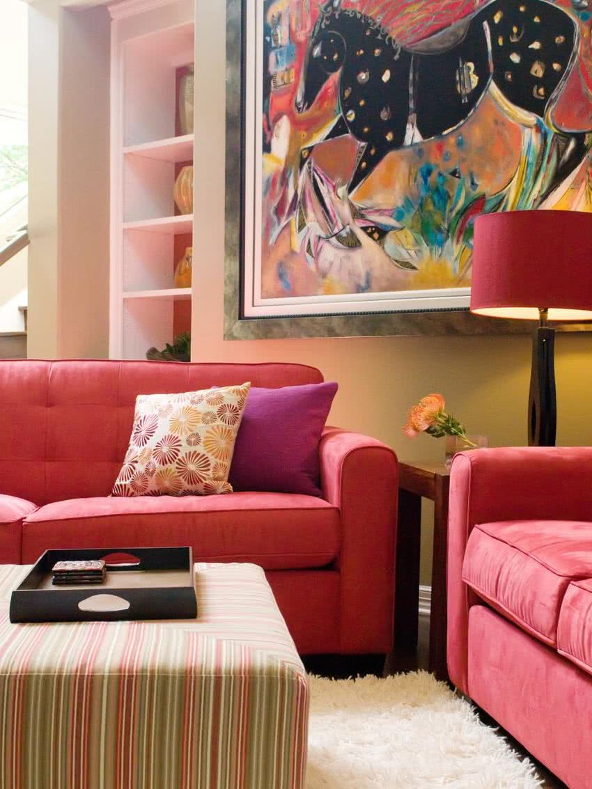
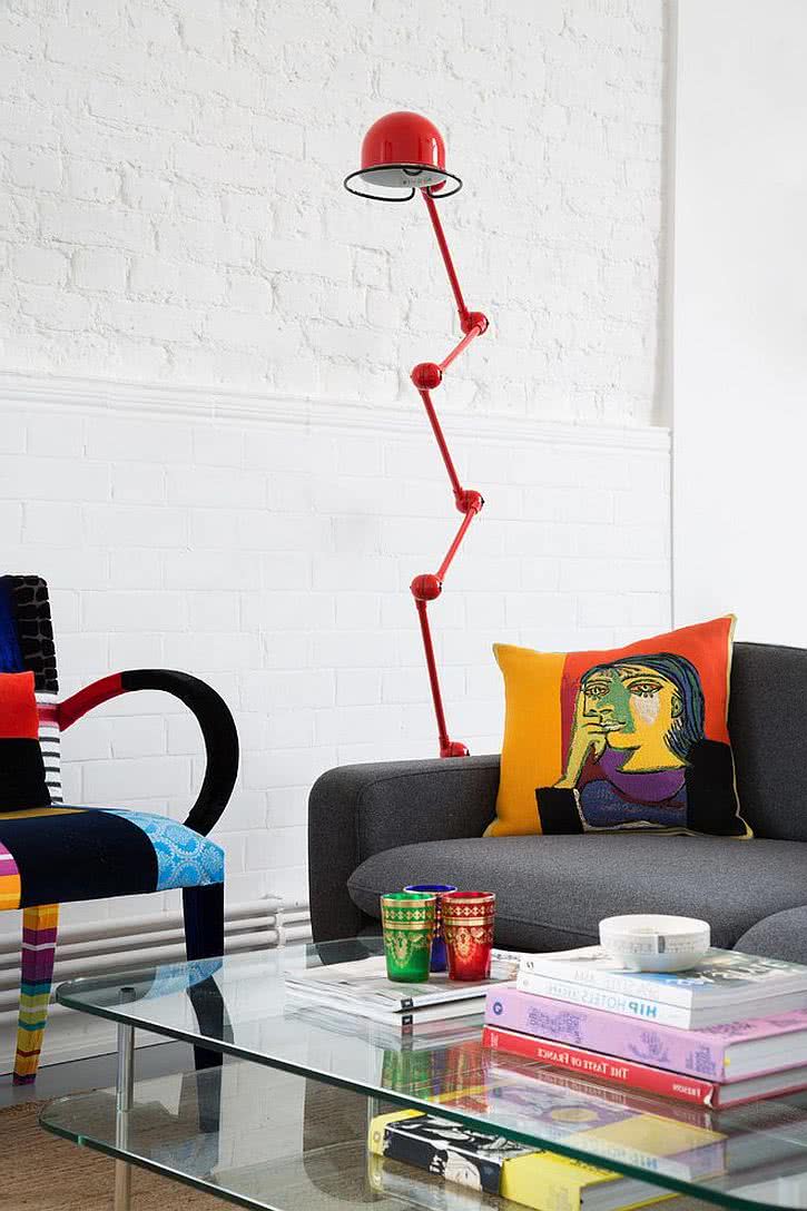
Considering that the living room is a place to relax and have fun, colors can be mixed in a bold way, such as red, fuchsia and orange.
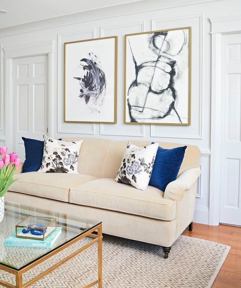
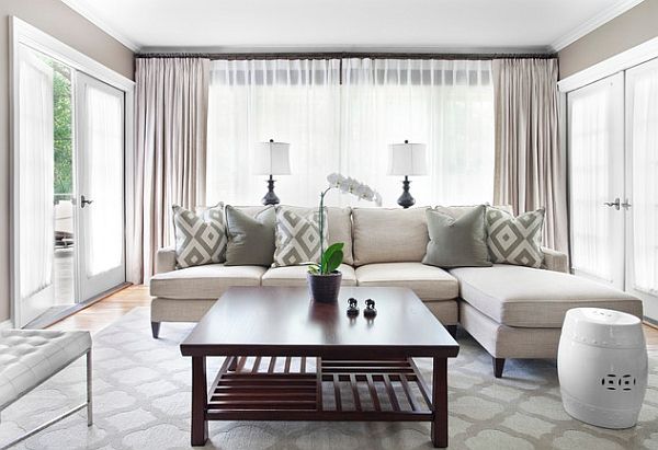
16- Blue and white
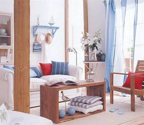
White, blue and red go perfectly together. The point of union with the house can be through dark woods, although they can also be light, achieving fresher results.
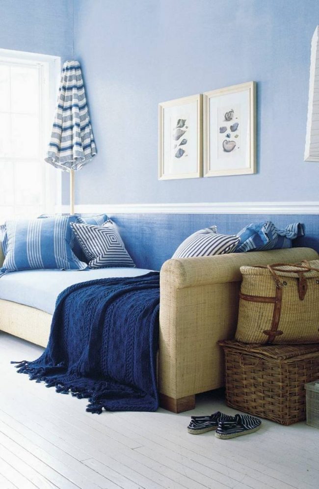
This image focuses on a pastel light blue, combined with nude colors, while taking advantage of the cushions to introduce strong tones, striped patterns and textures, which emphasize the tonality.
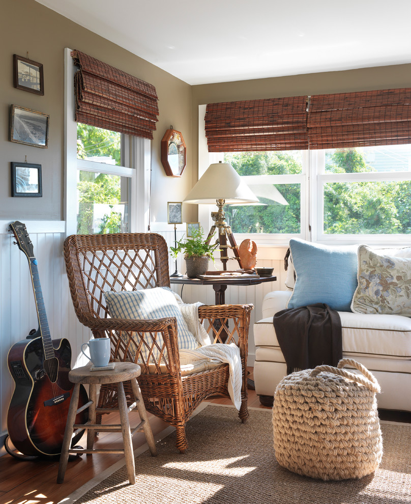
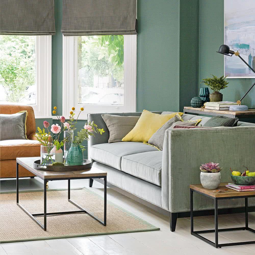
17- Green and beige
In the photos that you will see below, you will find the combinations of different shades of green with earth tones, purple and the magnificent combination with pastel light blue, complemented with nude, camel, khaki, lots of wood and wicker.
18- Lilac and purple
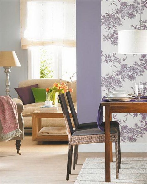
These colors combined with green, achieve very energizing spaces.
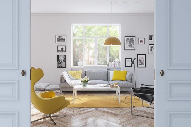
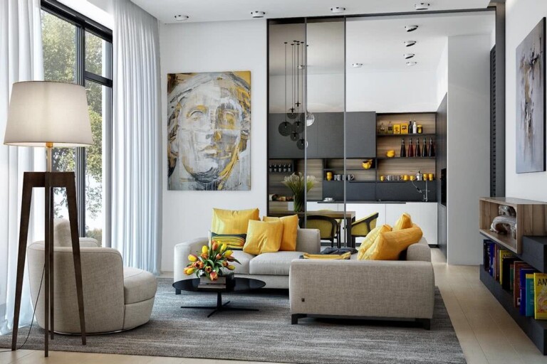
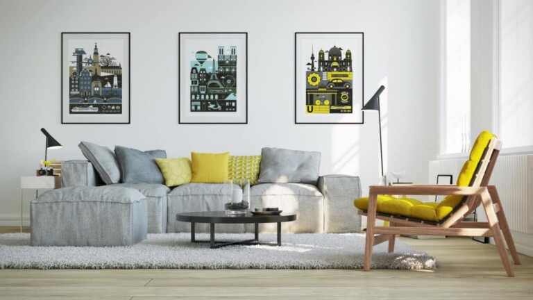
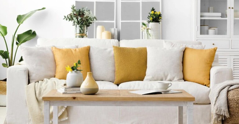
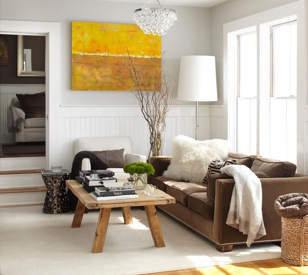
19- Yellow and neutrals
There are colors that are used very frequently in interior decoration, because they are classic and easy to combine. In addition, they are perfect because they do not require so much care. Some of those colors are brown, black, blue, and other dark tones that come in handy because they do not require constant cleaning.
But if you want an interior decoration in bright, summery and warm colors, which, although very light and that require great care in terms of cleaning, result in very pleasant atmospheres.
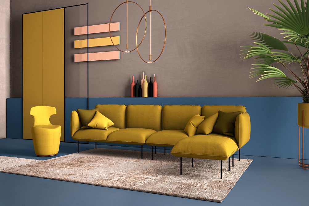
One of those colors that illuminate the room, make it feel warmer because they are summer colors, and combine well within many decorative styles, is yellow. Ideal for decorating a yellow living room with white, although we already know that yellow also blends well with other citrus colors such as orange or green.
In this case, the fusion of yellow and white gives us a flirty, modern, relaxed, illuminated but also “orderly” appearance. Yellow, like other light colors that look like it, give a neat feeling.
Colors for small rooms
20- Neutral colors
One of the most popular resources is the use of neutral colors on walls, floor, ceiling and furniture upholstery. A palette of muted whites or beiges will expand the space, pushing the walls away. Soft tones also tend to brighten a room as they reflect light better. In addition to enlarging an area, a neutral palette imparts instant sophistication and creates a calm environment.
21- Splashes of vivid colors
Just because your living room is small doesn’t mean you have to sacrifice color. You can use bright, fresh colors to add interest to the space. Just be sure to limit the palette to two or three colors for an invigorating, but not overwhelming, space.
22- Dark colors
Don’t be afraid to use dark colors, even in a small space. Lighter colors might make the room feel bigger, but deeper shades add drama and flair. If you go for a dark paint color, you can choose a semi-gloss or satin finish, which will reflect the light into the room. Leave the windows bare to keep the space light and airy.
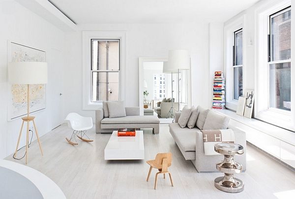
23- Just white
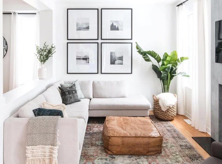
The white-based color scheme lends a calming and organized look to a small living room. White is a great option for reflecting light and adding visual space.
24- Light rugs
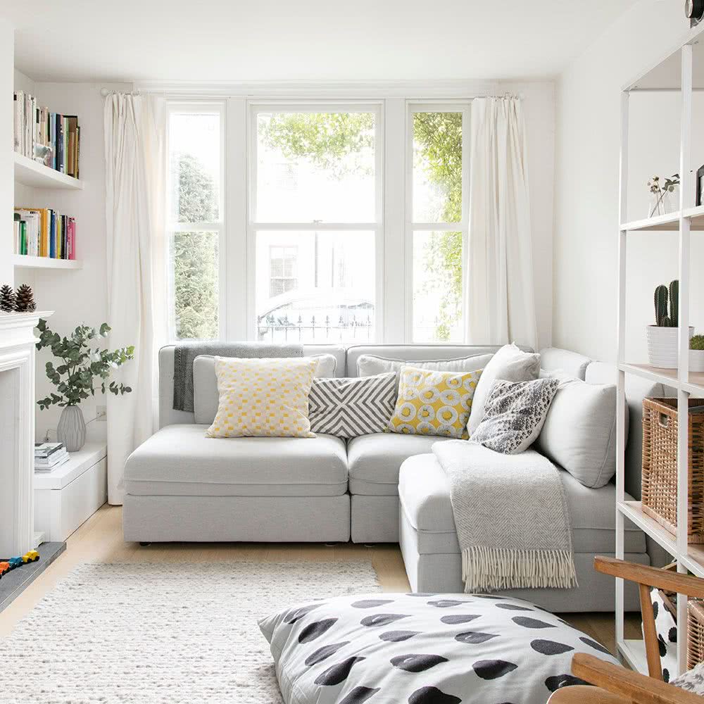
A light colored rug can expand a room, especially if the floor is dark in color.
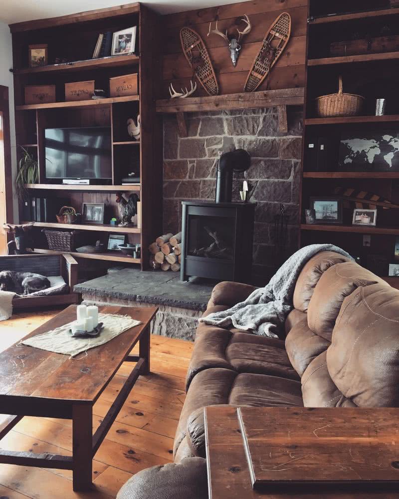
Colors for rustic rooms
25- Rustic green
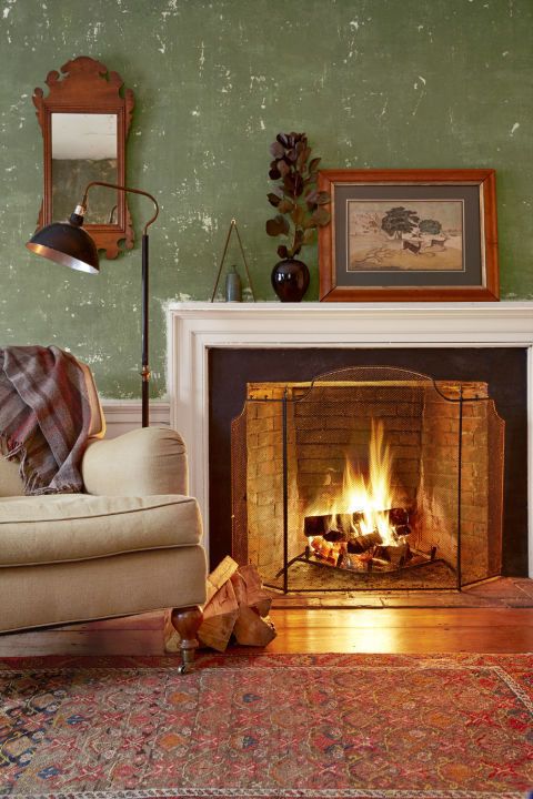
Muted green looks very inviting when paired with antiques.
26- Blue
In rustic houses, blue can be used as a contrasting color for furniture.
27- Gray
It doesn’t have to be gloomy when contrasted with whites, earthy browns, and other warm tones. Here, the walls are painted gray, achieving a rustic and sophisticated atmosphere.
28- Yellow
29- Whites
Brighten up your home by giving the walls a moderate touch of warmth with a shade of white.
30- Beige and brown
Colors for minimalist rooms
31- Neutral tones
Opting for a minimalist look does not mean that you should only use black and white in an impersonal and almost sterile way. In fact, there is a fine line between charming minimalist interiors and drab and boring ones. This is precisely why we suggest you induce a bit of flavor by playing with the different neutral tones.
32- Hints of color
Small touches of color can also be added to a minimalist room.