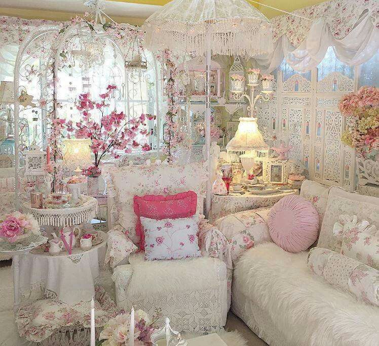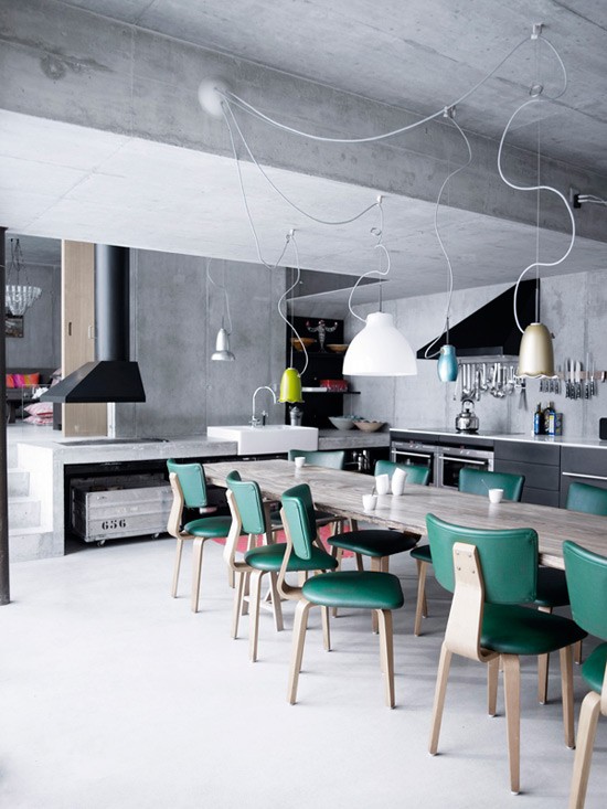
Looking for ideas to gain space, increase practicality, light, and decorate your home? Here you have it all!
A lot has changed from tenants to owners in the life of a young couple from São Paulo – except the address. They were already renting the 68 m² apartment when they had the opportunity to buy and renovate it. Consequently, they knew very well what they missed about the place and what was in good size. “We preserved much of what had been modified in a previous renovation, carried out by the first owner,” says the architect Pietro Terlizzi, hired by the residents to improve the decoration of the apartment.
Among tried and tested solutions and newly introduced interventions, discover the best ideas of this project one by one.
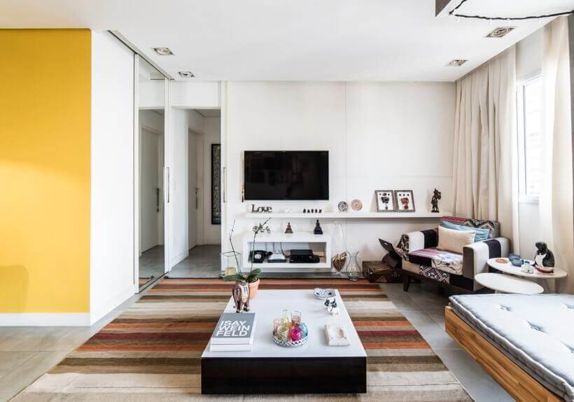
1- Integration of the balcony into the living room
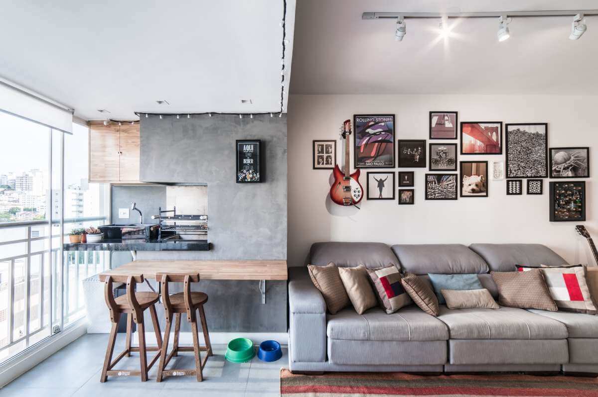
This has already become a classic resource to expand the social area, but it depends on the condominium’s authorization. If the convention allows the closing of the terrace, then the doors between the balcony and the living room can be displaced to add a few square meters to the internal area, as happened here.
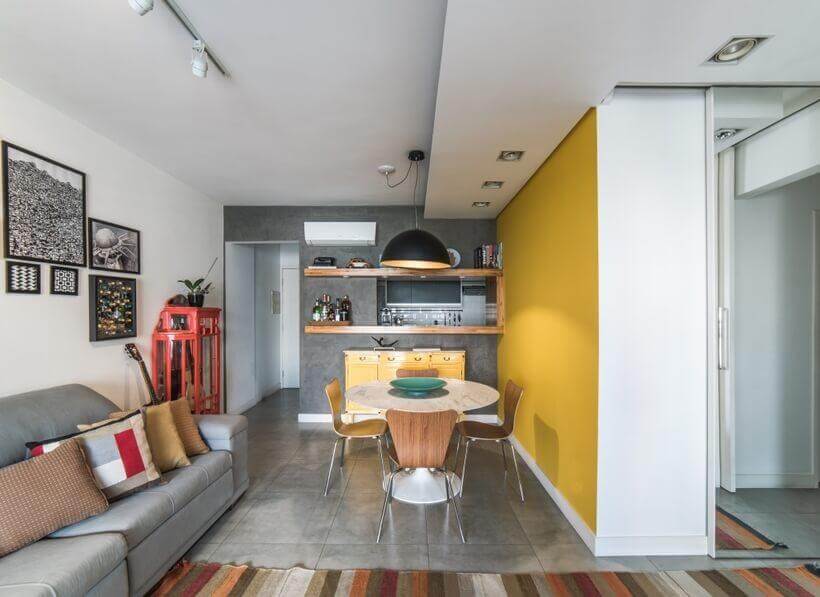
2- Cement burnt on the walls
Also, with the agreement of the condominium, the walls in the barbecue area changed their look. The colored paint came out, and the finished texture with a burnt cement effect came in, which is much more modern. “It is easier and cheaper to find a painter who knows how to apply this type of texture than a mason who is good at making real burnt cement,” says the architect, justifying the choice.
3- Barbecue bench
It has already proven helpful at barbecue time and as a support for those on the couch. But it had to be sanded and revarnished so it wouldn’t look old next to the new surfaces of the same wood, teak.
4- Lamp cord
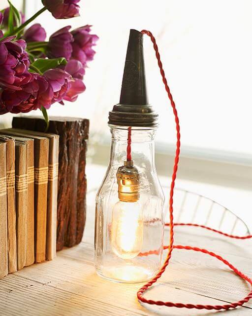
Fixed to the veranda’s ceiling, it guarantees charming lighting. And you can make this kind of light fixture known as a gambiarra – you can easily find the video on youtube there are many options. Electrical wire, light bulbs, sockets, and plug are enough.
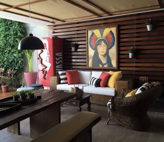
5- Frame Arrangement
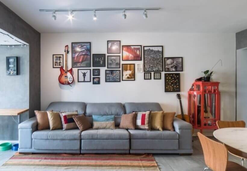
The panel mounted above the sofa is very charming! In the center is a picture of Buddha, the house dog. To harmonize images of different types and sizes, the architect standardized the frames: they are 2 cm high and are in matte black. Thus, he achieved a balanced composition, even with copies that arrived after the layout was ready. A resident’s guitar has found a perfect spot in the left corner, where music is the subject.
6- Tribute to a habit
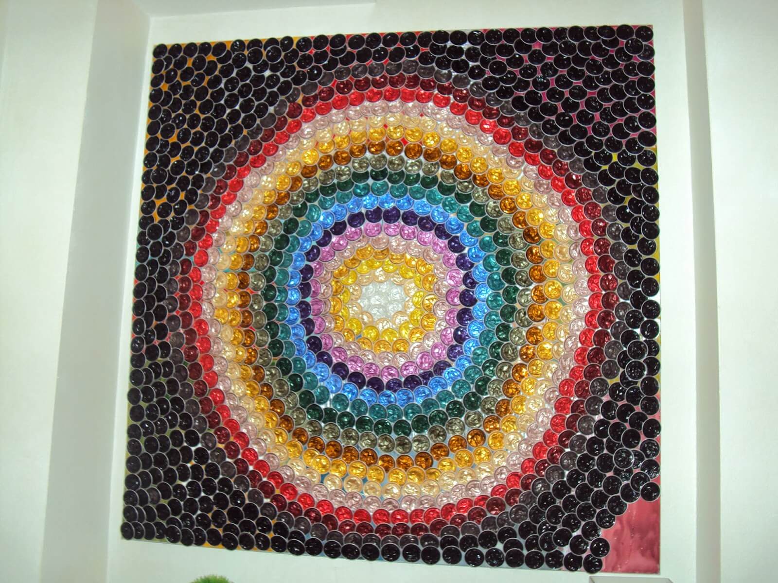
The resident is so fond of coffee that he made used capsules the of one of the paintings. “He saw the idea on a website, and we just did the same,” says Terlizzi. After being emptied and washed, the capsules were bonded with Super Bonder adhesive against the bottom of the box-type frame.
7- Rail lighting
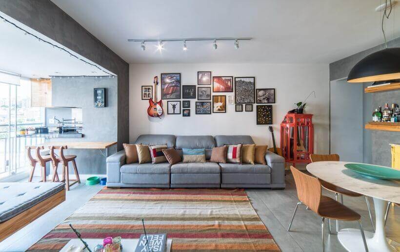
What values a beautiful arrangement of paintings more than accent lights? Therefore, the architect suggested the installation of a rail with movable spots in the living area. Just direct the lamps to what deserves to be more evident.
8- Single floor = feeling of larger space
“Although it was already connected to the living room, the terrace had a different finish, with a wooden deck,” says Pietro Terlizzi. “This interruption maintained the feeling of compartmentalization.” Because the deck was removed and, after leveling the subfloor, the same porcelain tile from the internal area advanced through the veranda.
9- Round table asks for less space
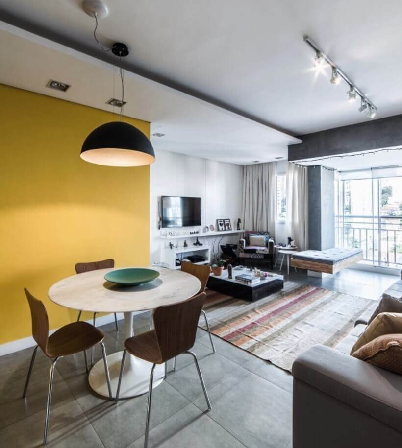
The table that the couple already owned was kept – it is the ideal size and shape for the place. Corner-free, it works better than a rectangular four-person model as it frees up circulation.
10- One less bedroom
Today, you can see the reading corner, with a patchwork armchair, the third bedroom in the original plan. But it no longer existed when the couple rented the apartment, so the room even holds a large, square coffee table.
11- The sliding door between wings
To save the space that the door to the intimate hall required when opening, the architect replaced it with a sliding model. However, this required installing a white panel on the living room wall, behind which the new door slides.
12- Decoration shelf
As it’s a lacquered panel, the TV wall isn’t the best place to hang pictures after pictures (have you thought about what to do with the holes?). But leaving her completely white wasn’t funny either. Thus came the idea of fixing a long shelf about 20 cm deep. This size is enough to arrange vases, picture frames, and other decorative objects that bring color to the surface.
13- Extended bench without feet
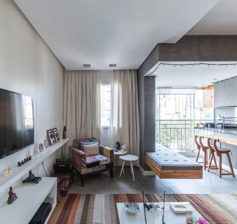
He also serves the barbecue, the seating, and the TV corner. The L-shaped bench starts on the terrace and enters the room, where it becomes more expansive. At this point, he embraces the pillar that marked the separation between environments. The trick for the furniture to appear floating is its hidden metal structure, which was embedded in the post. This feature made the feet unnecessary, resulting in a lighter look.
14- Access to the toilet is mirrored
Did you notice the right side of the photo above? There is the entrance to the lavatory, a door covered with a mirror from top to bottom. “It was the only place in the apartment where we could put a mirror for the residents to see themselves in their entirety,” explains Terlizzi. The benefit was twofold because the mirror duplicates the image of the room, making it appear larger.
15- Two in one: plate and shelves
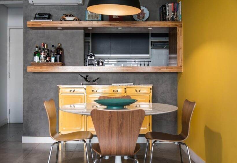
Here’s another idea preserved by the current renovation: an opening connecting the kitchen to the dining room. The ingenuity of the solution goes beyond the simple niche, as the teak planks that cover the interior of the opening expand on both sides of the wall, giving rise to two shelves in each of the rooms. This means more storage and display area for utensils, such as the coffee machine and the tray that makes up the bar.
16- Wildcard bench
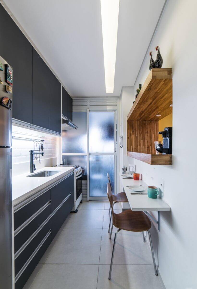
The white tabletop below the plate makes all the difference in the kitchen. In addition to being perfect for breakfast, it also serves as a support area when the sink countertop is complete. Because it has a retractable mechanism, the bench can be folded down when not in use, increasing circulation.
17- Illuminated tear
The kitchen has gained a plaster lining. Cut from one end to the other, it received LED lighting that brightens the entire environment.
18- Multifunctional headboard
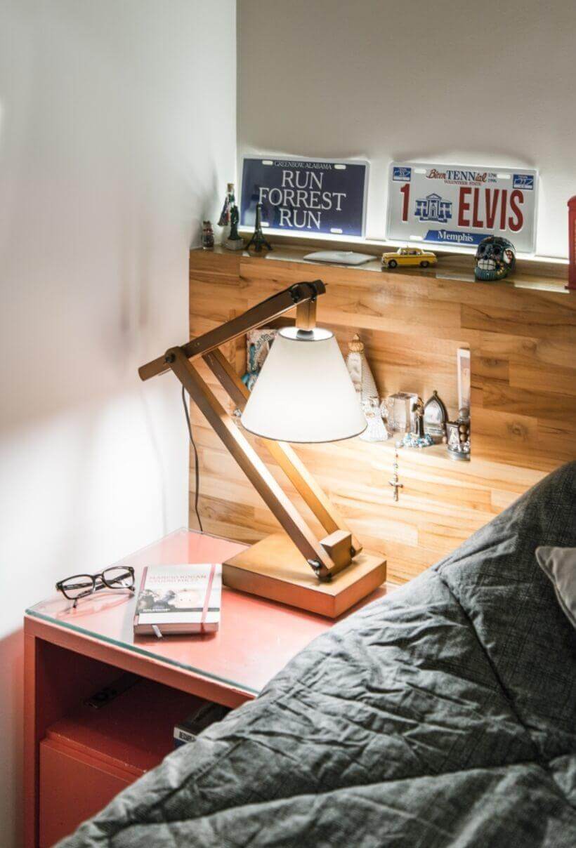
With a few centimeters deep, the headboard expands the support area provided by the compact bedside tables. The architect made it even more functional by opening a slit at its top and attaching a LED strip and an acrylic lid. The lighting is perfect for watching TV.
19- Corner Boxing
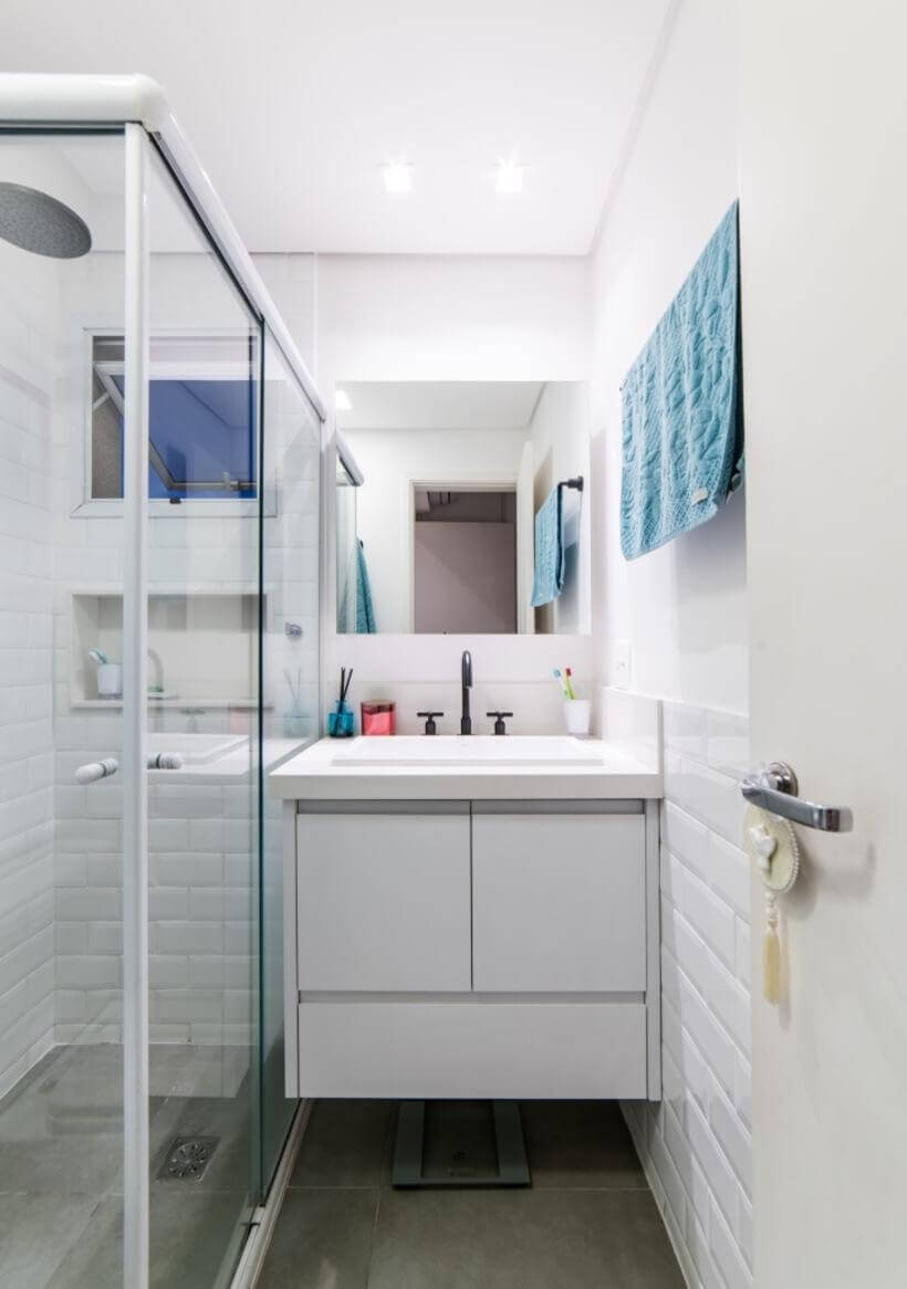
The suite’s box is as small as the bathroom that houses it. So that its opening would not be impaired, the architect recommended a model that opens in the corner, sliding a sheet to each side.
20- Instead of boxing, lockers
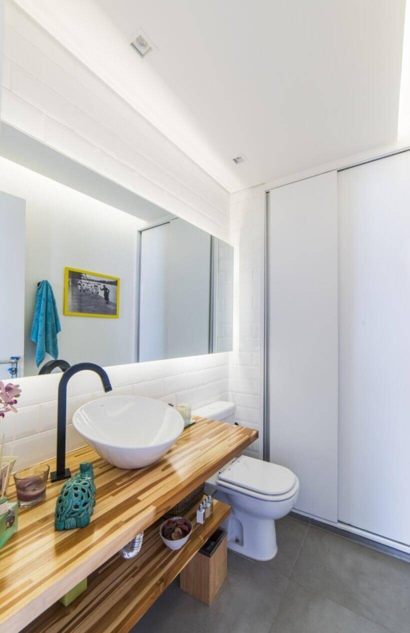
There were plenty of reasons to eliminate the shower in the second bathroom, now converted into a toilet. First, the couple rarely used it. Second, he greatly missed a wardrobe and pantry. And that was the fate of boxing: it became a closet divided into two parts. From the toilet, residents access the laundry room while the pantry opens on the laundry side.