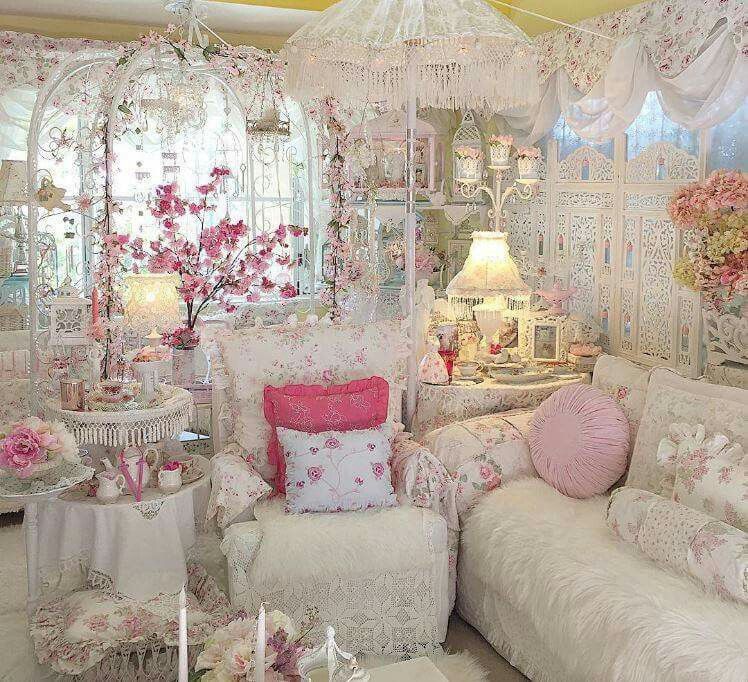
With DIY techniques and the ideal choice of color, the house can take on a new look. During the quarantine, the term “painting the wall” had a significant growth in searches, according to data from Google Trends. Spending more time indoors has given many people the desire to change and redesign the corners and, thus, bring new air to the environments. The colors even has the power to completely change a setting in a few steps. This is one of the reasons why Coral is the official paint for this project.
The brand is a long-time companion to the largest exhibition of architecture, decoration and landscaping in the Americas. At a time when change and new ways of living are on the agenda, Coral is showing itself as a great decoration revolutionary, with just a few brushstrokes.
In 2021, the brand bets on Pedra Esculpida as its color of the year, as in addition to stimulating, the tone refers to nature and the simplest things. In a moment of reconnection with the interior, like the one we are living in, it is ideal, as it can be used as a base on the walls of the house, bringing calm and, even so, allowing other colors to stand out as well.
Below, we made a selection of 12 environments that bet on color as the main element of the project. Most of them can yield a beautiful design make yourself. It’s a great opportunity to bring the whole family together in the project and give the home decor a boost. Check out!
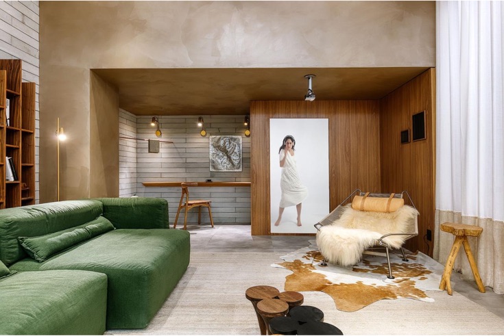
1. Soft colors reminiscent of skin tones
The walls and screens are the main highlight of the project. Here, the color set the tone in the environment through shapes and nuances that fit together harmoniously. Six colors from Coral were used in the project and distributed in a patchwork . The gradation of tones between the wall and the screen is smooth and not aggressive to look at. The project used the colors Caradecasa Calcario Greek Culture Prayer Temple and Brick Road.
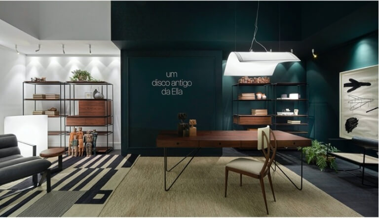
2. Mixing vibrant tones activates affective memory
Carolina Campos and Maria Magalhães sought tonalities that told stories and brought memories and joys. The paints used in the Memory Room were Grape Pudding and Monarca Gold. Shades were applied to entire walls that overlap and give an interesting look.
3. Velvety effect gives coziness
Natural materials guided the choice of architect Igor Zanon at Refúgio Familiar, at Janelas CASACOR Minas Gerais. The architect thought about the concept of a nest to design the space, and bet on the tone Pedra Esculpida – chosen the color of the year 2021 by Coral – to make the study corner even more comfortable. In the application, the Velvet effect was used to check the nuances of brightness in the tone.
4. Colors delimit spaces in this home office
Having to adapt a home office at home was a great challenge for many people in 2020. Thinking about the difficulty of finding a balance between work and decompression, architect Carol Horta bet on colors to delimit spaces. At the Home Office the professional used the color Infinito, a dark green that encourages reflection and production. On the other side, the walls are painted with Banco de Neve paint, providing a space for relaxation.
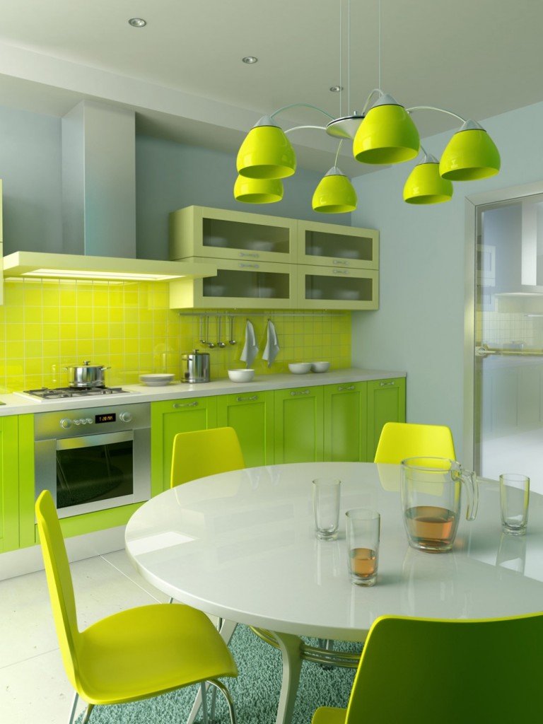
5. Vibrant tones in the kitchen
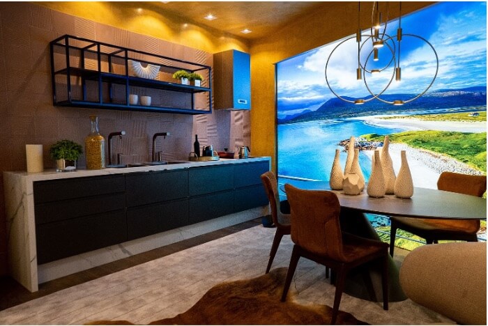
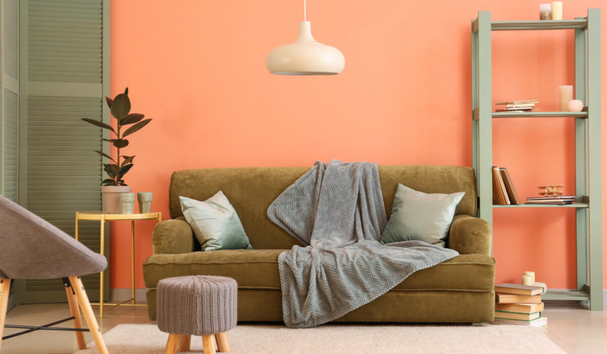
The project by the architect Mariana Paula Souza has the kitchen as the main environment in the house, and bets on colors to give coziness. The choice of Paçoca Doce paint, applied with the Special Marbled Effect, was to seek a sunny image, perfectly fitting the residents who sit at the table.
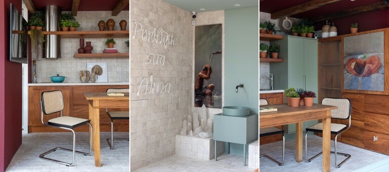
6. Terracotta tone envelopes gourmet space
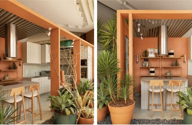
At the Gourmet Station, designed by Manarelli Guimarães Arquitetura, the terracotta tone envelops the structures and brings a cozy feeling. The color chosen by the architects is the Extreme South and was applied with the Special Velvet Effect. The off-white coatings and the choice of plants with lots of green provide a visually pleasing environment for visitors.
7. Six shades of a single color
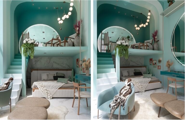
The Ring Light Room, designed by Thayane Santana Arquitetura, at Janelas CASACOR Balneário Camboriú, bets on six different shades of a single color and brings an incredible visual effect. The colors used were: Radiant Green, Water with Lemon, Dawn with Mist, Citrus Foam, Green Aquarium and Italian Stone. Color strips were used on the walls, ceilings and steps to check the desired gradient.
8. Urban references through color
The 25 m² apartment, fully integrated, used the color Tubarão Branco, with the Velvet Effect to combine tones with textures. The use of lighter tones allows for an even greater emphasis on wood, used in furniture and on the floor.
9. Burnt cement never goes out of style!

The Online Study Room bets on two styles that are here to stay: burnt cement and neon sign. The use of the product Coral Decora Special Burned Cement Effect, in the Wet Granite color, is one of the main highlights of the environment, which brings a modern and youthful air.
10. Geometric shapes created with paint
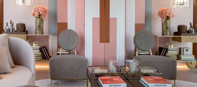
The architects Juliana Affini and Patrícia Makhoul used the colors Carved Stone, Natural White, Bluff Red, Romantic Gift, Tibetan Bronze and Modern Luxury. Shades were used on the walls and ceiling. The effect of the walls, with geometric shapes, was created by Lúdico Arte artists.
11. Pastel and terracotta colors mix in the hall
The hall was redefined, with the resident’s health safety in mind. A tub was installed right at the entrance, along with photos that refer to water and cleaning. The pastel colored furniture blends with the terracotta wall and wooden furniture giving a stunning look. The colors used were Calmaria Verde and Classic Wine.
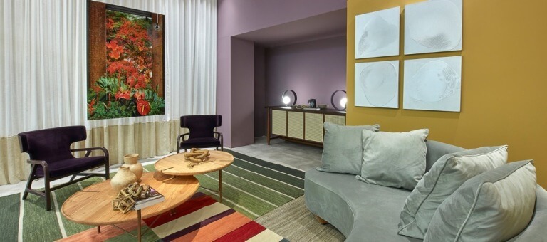
12. Surrounded by dark green, the elephant is in the middle of the room!
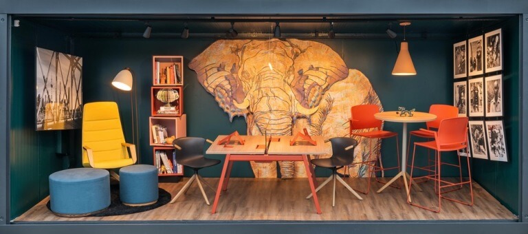
We need to talk about the elephant in the ETC environment, designed by Fernando Brandão. Graffiti by an artist, the Elephant is in the center of the wall, painted around it in a dark Coral green (Indian Embroidery color). The sober tone makes the environment more serious, but still with space for decompression, without leaving comfort aside